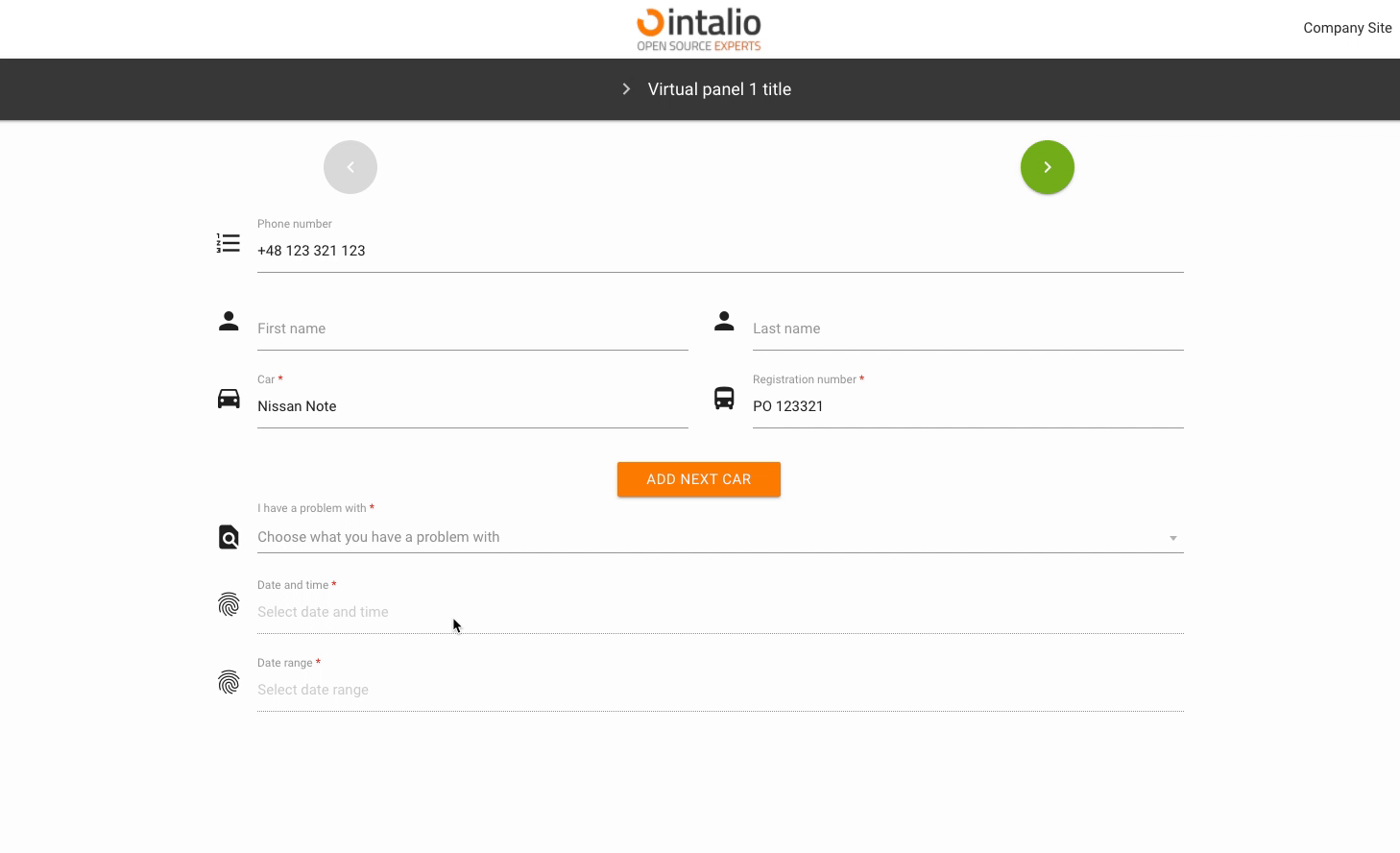
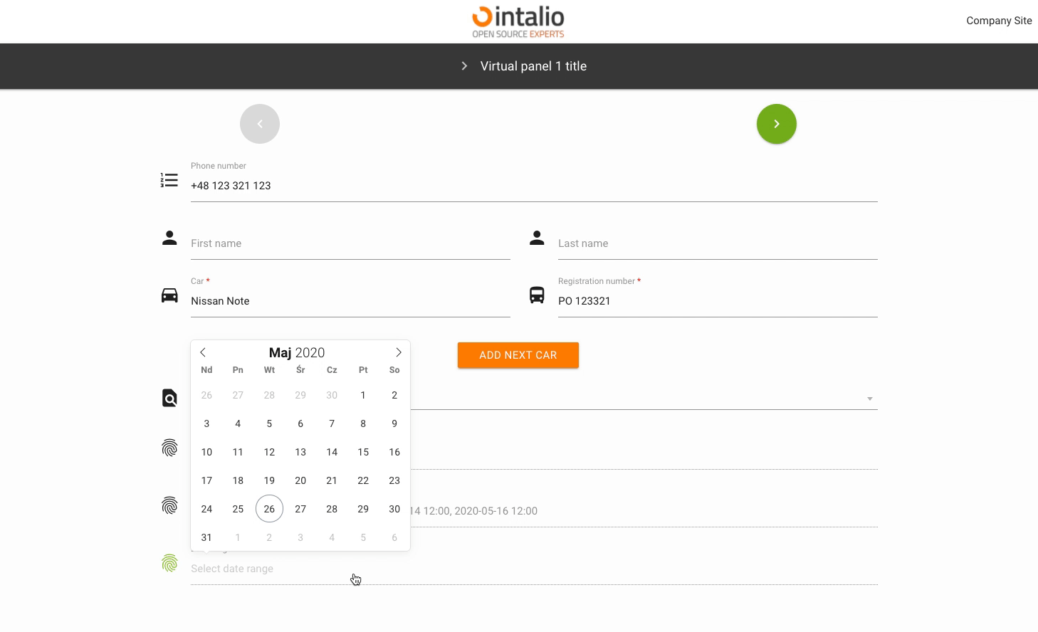
DateTime
DateTime (datetime)
Example:
{
   "size":"s12 m12",
   "type":"datetime",
   "id":"ExampleID",
   "label":"Example Label",
   "validate":[
      ""
   ],
   "icon":"person",
   "hidden":false,
   "datetime_config":{
      "locale":"English",
      "enableTime":false,
      "mode":"range",
      "time_24hr":true,
      "dateFormat":"Y-m-d H:i:00",
      "altInput":true,
      "altFormat":"Y-m-d H:i"
datetime_config
The date and time component is very extensive. The whole configuration in this case is in "datetime_config" and is passed directly to the component.
locale
Calendar language
enableTime
If you want the calendar to also display a component for time selection, you must have this option checked.
time_24hr
24-hour date format.
dateFormat
Output format, you can determine whether you want to send the day, month, year, hour, minute or you want to format it completely different.
This is an output format not shown on the screen! To change the format of the data displayed on the screen, use "altInput".

altInput
Do you run an alternative date display.
altFormat
Alternative date display, i.e. the outgoing date will be formatted on the basis of "dateFormat", but will be displayed on the basis of "altFormat"
noCalendar
Display only the component responsible for the time.
mode
Calendar mode. You can set whether someone should select a single date, a date range or whether they can select several independent dates.
none
A simple action.
multiple
Multiple date selection.
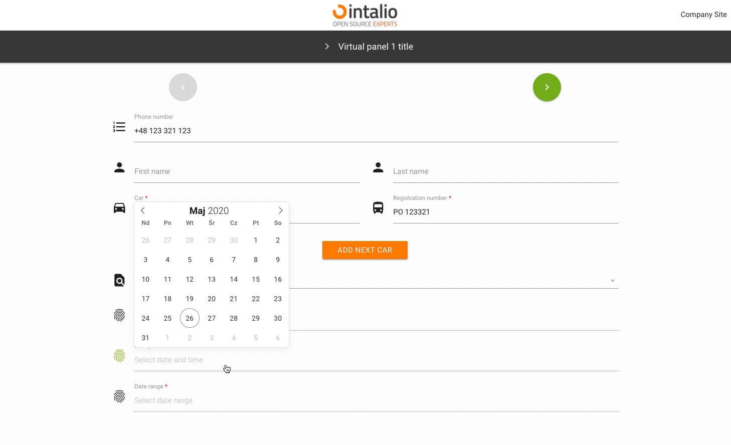
range
Selectable date range.
enable
Add the ability to select dates only from specific date ranges.
from
to
The rest of the available parameters:
This field supports all parameters with "Attributes available for each field".