This is an output format not shown on the screen! To change the format of the data displayed on the screen, use "altInput".
[](https://docs.intalioservices.com/uploads/images/gallery/2020-05/yNYTiqpIV1YKbNwF-image-1590498552766.png) ### altInput Do you run an alternative date display. ### altFormat Alternative date display, i.e. the outgoing date will be formatted on the basis of "dateFormat", but will be displayed on the basis of "altFormat" ### noCalendar Display only the component responsible for the time. ### mode Calendar mode. You can set whether someone should select a single date, a date range or whether they can select several independent dates. #### none A simple action. [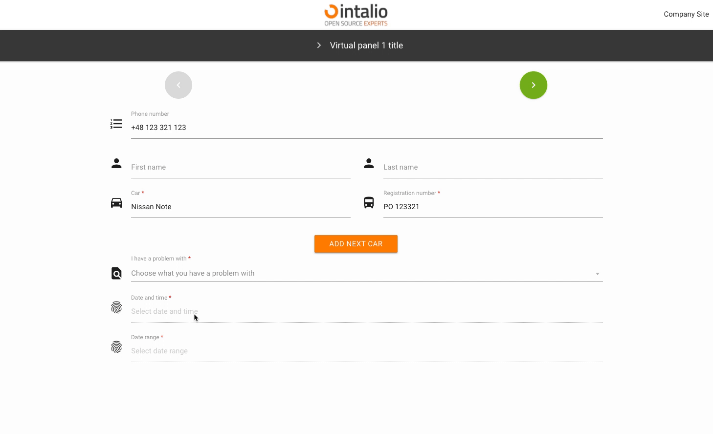](https://docs.intalioservices.com/uploads/images/gallery/2020-05/MmIBLbDBLouge2pk-image-1590501699889.gif) #### multiple Multiple date selection. [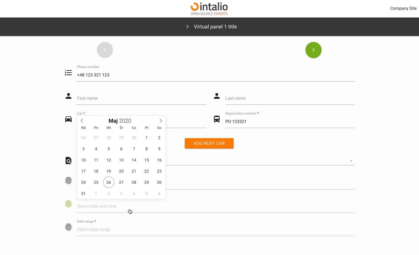](https://docs.intalioservices.com/uploads/images/gallery/2020-05/ORGNLIN8n34zUj8n-image-1590502680596.gif) #### range Selectable date range. [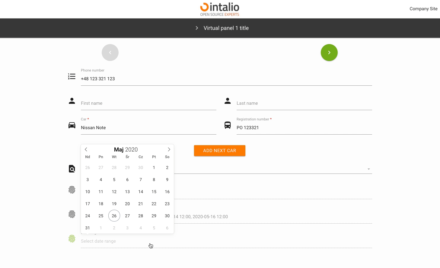](https://docs.intalioservices.com/uploads/images/gallery/2020-05/DcEKrIZEGlvw1rSC-image-1590502727262.gif) ### enable Add the ability to select dates only from specific date ranges. #### from #### to ### The rest of the available parameters:This field supports all parameters with ["Attributes available for each field".](https://docs.intalioservices.com/books/dynamic-forms---installation-and-administrators-guide/page/attributes-available-for-each-field "Attributes available for each field")
[FlatPickr options](https://flatpickr.js.org/options/)