Structure and content of the configuration file
label
{
// General configuration of the form
"panels": [
{
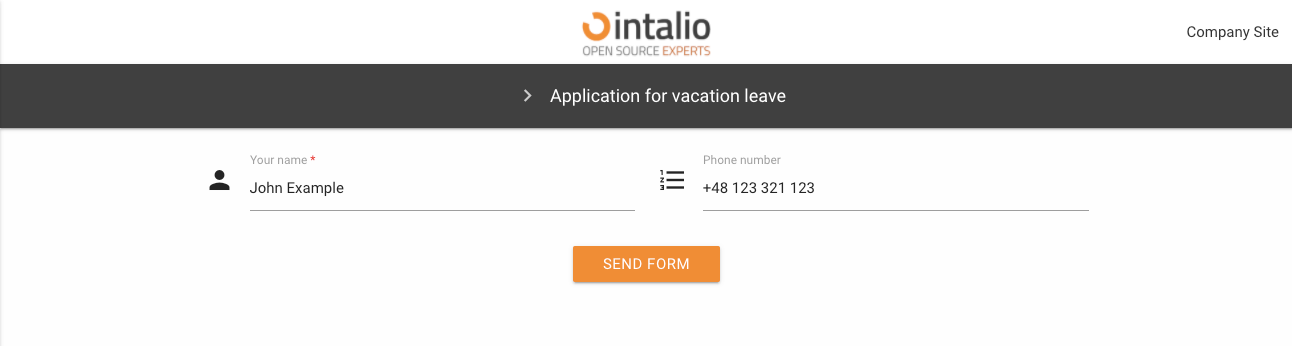
"name": "Application for vacation leave",
"fields": [
// Fields on the form
]
}
],
"translations": {
"en": {
// Translations
},
"pl": {
// Translations
}
}
}
General configuration of the form
default_lang
Default form language. Here we enter the key from the translations section e.g. "en".
Remember that the form translations must be defined in the translations section!
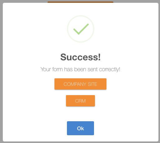
redirect
The address of the redirection after the form has been correctly submitted. After clicking the send button.

custom_redirect
Custom redirect allows you to create your own redirection buttons after the form is correctly submitted.
check_session_id
This parameter can be either true or false.
True: The session will be checked on the backend side and if not correct, the form will not be added to the OTRS.
False: The session will not be verified on the backend side.
send_empty
Are you going to send blank fields. If this option is checked, the blank fields will also appear in the data sent by the form (which will lead to their display in the article).
name
Name of the form.
description
Description of the form.
nextStep
Content of the redirection button to the form.
icon
The icon... The dynamic forms mechanism uses icons compatible with materialDesign.
https://material.io/resources/icons/?style=baseline
disabled
active
Should the form be active and clickable.
hidden
The form is to be shown in the list of available forms
Fields on the form
Each form must have some fields :D Dynamic forms allow you to create multiple field types. Each form field has a set of standard configurations. Additionally, fields can contain their own configurations.
These are settings that you can activate in any field.
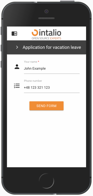
size
The size of the field is defined on the basis of blocks, divide the screen into 12 parts and determine the size of the field "filling in these parts".
12 will set the field size for the whole screen, 6 will set the field size for half the screen.
Screen sizes are defined by the letters s,m,l (small, medium, large). Setting s12 m6 l3 will set the value 12 for small screens, 6 for medium screens and 3 for large screens.
size: s12 m6
type
Field type, here we enter the specific field type you want to use e.g. select, text.
id
field identifier.
This value must be unique and must not contain spaces!
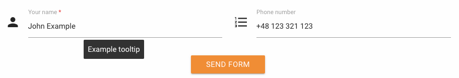
tooltip
When you hover over the field, a balloon will pop up, displaying any text or HTML.
label
Here you can enter the field title e.g. "Your name".
validate
Here we can enter a list of any field validations (we can also create our own regex). An example of a validator is "required".
Available validators
after
alpha
alpha_dash
alpha_num
alpha_spaces
before
between
confirmed
credit_card
date_between
date_format
decimal
digits
dimensions
email
ext
image
in
integer
ip
is
is_not
length
max
max_value
mimes
min
min_value
mimes
min
min_value
not_in
numeric
regex
required
size
url