# Field size and responsive web design

### Dynamic forms can work on large, medium and small screens as well as on smartphones.

<p class="callout warning">The size of fields is set in the parameter **size.**</p>

<p class="callout info">The system can also work as an application installed on the phone in the form of PWA.</p>

We are using a standard 12 column fluid responsive grid system. The grid helps you layout your page in an ordered, easy fashion.

[![image-1590660168382.png](https://docs.intalioservices.com/uploads/images/gallery/2020-05/scaled-1680-/ozxPCiACEp3Ouf3h-image-1590660168382.png)
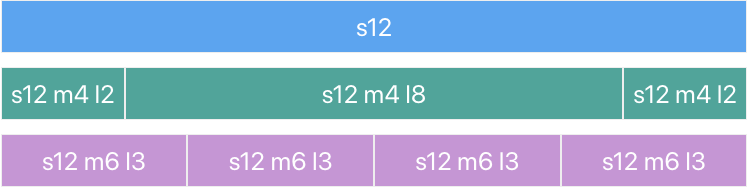
](https://docs.intalioservices.com/uploads/images/gallery/2020-05/ozxPCiACEp3Ouf3h-image-1590660168382.png)

###  

### 12 columns

Our standard grid has 12 columns. No matter the size of the browser, each of these columns will always have an equal width.

<p class="callout info">For now, just know that the `s1` stands for small-1 which in plain English means "1 column on small screens".</p>

###  

### Offsets

To offset, simply add `offset-s2` to the class where `s` signifies the screen class-prefix (s = small, m = medium, l = large) and the number after is the number of columns you want to offset by.

[![image-1590660033256.png](https://docs.intalioservices.com/uploads/images/gallery/2020-05/scaled-1680-/c4N0O81JB6g9lmxO-image-1590660033256.png)
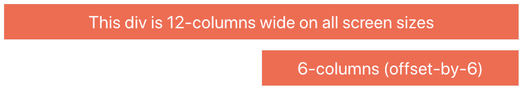
](https://docs.intalioservices.com/uploads/images/gallery/2020-05/c4N0O81JB6g9lmxO-image-1590660033256.png)

###  

### Responsive Layouts

#### Screen Sizes

<table class="highlight" id="bkmrk-%C2%A0-mobile-devices%3C%3D-6" style="height: 132px;"><thead><tr style="height: 45px;"><th class="align-center" style="height: 45px; width: 154px;"> </th><th class="align-center" data-field="id" style="height: 45px; width: 118px;">Mobile Devices  
&lt;= 600px</th><th class="align-left" data-field="name" style="height: 45px; width: 114px;">Tablet Devices  
&gt; 600px</th><th data-field="price" style="height: 45px; width: 129px;">Desktop Devices  
&gt; 992px</th><th data-field="price" style="height: 45px; width: 170px;">Large Desktop Devices  
&gt; 1200px</th></tr></thead><tbody><tr style="height: 29px;"><td style="height: 29px; width: 154px;">**Class Prefix**</td><td style="height: 29px; width: 118px;">`s`</td><td style="height: 29px; width: 114px;">`m`</td><td style="height: 29px; width: 129px;">`l`</td><td style="height: 29px; width: 170px;">`xl`</td></tr><tr style="height: 29px;"><td style="height: 29px; width: 154px;">**Container Width**</td><td style="height: 29px; width: 118px;">90%</td><td style="height: 29px; width: 114px;">85%</td><td style="height: 29px; width: 129px;">70%</td><td style="height: 29px; width: 170px;">70%</td></tr><tr style="height: 29px;"><td style="height: 29px; width: 154px;">**Number of Columns**</td><td style="height: 29px; width: 118px;">12</td><td style="height: 29px; width: 114px;">12</td><td style="height: 29px; width: 129px;">12</td><td style="height: 29px; width: 170px;">12</td></tr></tbody></table>

[![image-1590660127114.png](https://docs.intalioservices.com/uploads/images/gallery/2020-05/scaled-1680-/jnUjLyClwyEvQYj7-image-1590660127114.png)](https://docs.intalioservices.com/uploads/images/gallery/2020-05/jnUjLyClwyEvQYj7-image-1590660127114.png)