Please make sure that the Intalio Router package is already installed in your system before proceeding further!
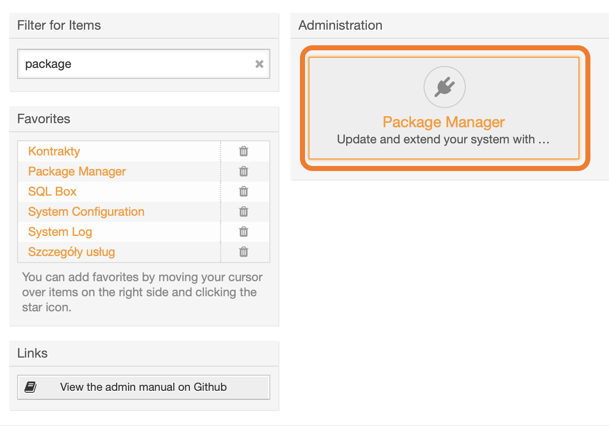
To install the package, login to your OTRS system and open the *Admin / Overview* page. [](https://docs.intalioservices.com/uploads/images/gallery/2020-04/tUVq6XcHp2xOcUfd-image-1586871001935.png) --- Find the Package Manager.You can use the **Filter for Items** field to narrow down visible options.
[](https://docs.intalioservices.com/uploads/images/gallery/2020-04/CEmLfHTOLr7IXzum-image-1586871252743.png) --- In the **Actions** block on the left, click *Choose file,* upload the **opm** file and click *Install Package*. [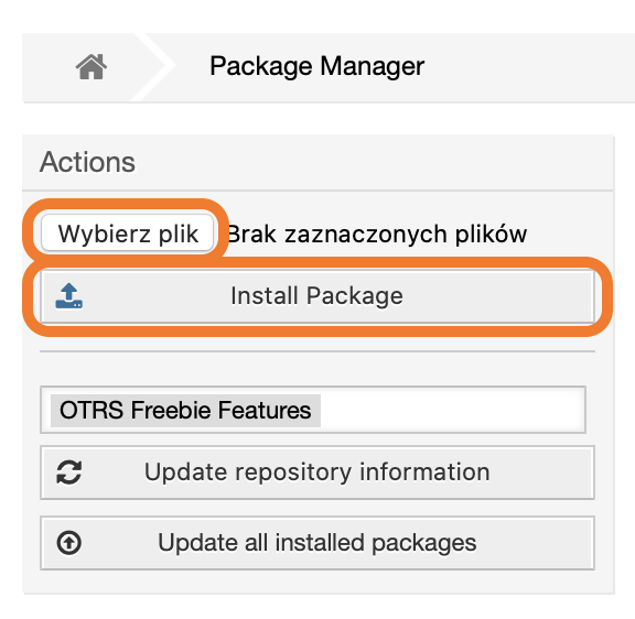](https://docs.intalioservices.com/uploads/images/gallery/2020-04/GbZd1cIKLUxBxxjH-image-1586871458563.png) If you see a notification about an unverified package, click Continue to proceed with the installation. ---If the installation was successful, you should see a welcome message on the screen.
# Form configuration - files # File and directory structure [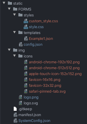](https://docs.intalioservices.com/uploads/images/gallery/2020-05/LuJRoyKix22j32By-image-1590056140122.png) Excluding the files and directories necessary to operate the system (i.e. css, fonts, js, service-worker.js), the main application directory contains several elements that are of interest to us: ##### `/FORMS` directory In this folder we will define and style all our forms. ##### `/styles` directory files that allow you to configure the appearance of the form (changing colors, styling views, control buttons, etc.). ##### `/templates` directory configuration files of each form ##### `config.json` file list of active forms ##### `SystemConfig.json` file Main system configuration, here you set communication with OTRS, default language and many more \[\[\[more in the Main configuration file - global settings\]\]\]. ##### `manifest.json` file This file is responsible for PWA settings (for more advanced users), if you are not an advanced user - leave it as it is. ##### `index.html` file In this file you can change the title of the form page, you can change it by changing the text in the <title></title> attribute. # Main configuration file - global settingsThis topic refers to the file static/SystemConfig.json.
##### Example configuration file: ```JSON { "SystemUrl": "XSYSTEM_URLX", "Alias": "XSYSTEM_ALIASX", "SystemUrl_DEV": "www.example.com/system" "ShowLangButton": true, "LangButtonColor": "#333333", "GlobalLang": "pl", "RedirectButtons": [ { "color": "#333333", "label": "Moje zgłoszenia", "redirectURL": "https://yahoo.pl" }, { "color": "#333333", "label": "Nowe zgłoszenie", "redirectURL": "https://google.pl" } ] } ```Description of individual values:
`OtrsUrl/SystemUrl` - Address of the OTRS/OTOBO module that will accept the request `Alias` - Alias under which the forms will appear `ShowLangButton` - Should the language change button be visible (if we have only one language, we can hide it) `LangButtonColor` - Color of the language change button `GlobalLang` - Default form language (loaded by default, unless otherwise specified by OTRS configuration) `RedirectButtons` - Optional forwarding buttons > Company Site is an additional redirection button > [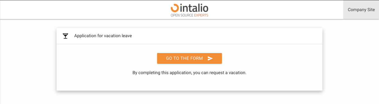](https://docs.intalioservices.com/uploads/images/gallery/2020-05/hEmPcuWdQNdQFXyk-image-1590053365666.png)RedirectButtons parameters - this parameter counts an array with objects containing parameters `show` - should the button be visible `color` - color of the redirection button `label` - button caption `redirectURL` - forwarding address
# File activating the form and setting the order in HUBThis topic refers to the file static/FORMS/config.json.
```JSON [ "ExampleForm1.json", "ExampleForm2.json", ] ``` This file is responsible for form activation and the order of forms in the HUB.Every form you want to see in the menu must be entered here (even if it is hidden in the HUB).
The order of the forms on the list corresponds to the order in the HUB. [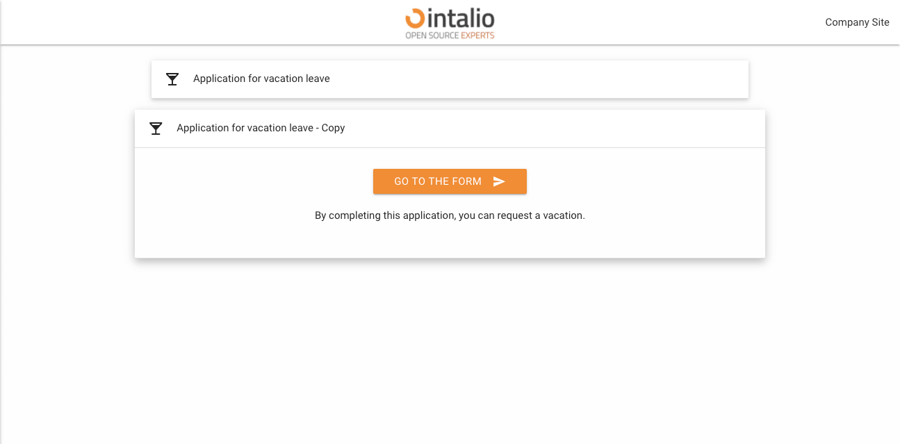](https://docs.intalioservices.com/uploads/images/gallery/2020-05/bcxEGWRYMs1tePt4-image-1590064000995.png) # Form configuration - basic # Form configuration - file structure and general configuration ```JSON { // General configuration of the form "panels": [ { "name": "Application for vacation leave", "fields": [ // Fields on the form ] } ], "translations": { "en": { // Translations }, "pl": { // Translations } } } ``` ## General configuration of the form ### default\_lang Default form language. Here we enter the key from the translations section e.g. "en".Remember that the form translations must be defined in the translations section!
### redirect The address of the redirection after the form has been correctly submitted. After clicking the send button. [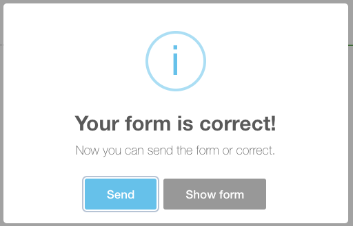](https://docs.intalioservices.com/uploads/images/gallery/2020-05/uEmrLjDa0HpR4BoJ-image-1590079457261.png) #### ### custom\_redirect Custom redirect allows you to create your own redirection buttons after the form is correctly submitted. [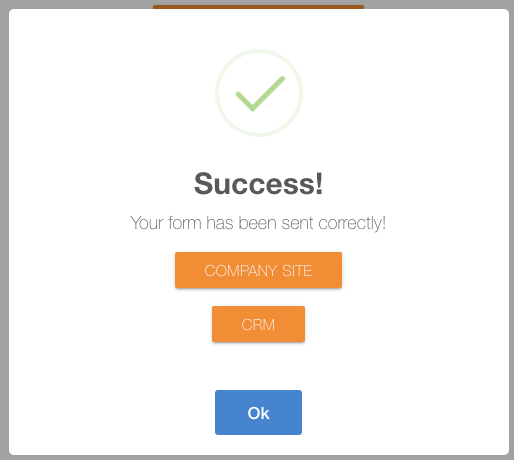](https://docs.intalioservices.com/uploads/images/gallery/2020-05/l27NdHwqJ8epQAG1-image-1590080906819.png) ##### Custom redirect configuration example: ```JSON "custom_redirect": [ { "text": "Company Site", "redirect": "google.pl" }, { "text": "CRM", "redirect": "google.pl" } ] ```The parameter with the URL is "redirect" not "url".
This function transfers the parameters of the current URL (e.g. session)
### check\_session\_id This parameter can be either true or false. **True**: The session will be checked on the backend side and if not correct, the form will not be added to the OTRS. **False**: The session will not be verified on the backend side. ### send\_empty Are you going to send blank fields. If this option is checked, the blank fields will also appear in the data sent by the form (which will lead to their display in the article). ### name Name of the form. ### description Description of the form. ### nextStep Content of the redirection button to the form. ### icon The icon... The dynamic forms mechanism uses icons compatible with Material Design.[https://material.io/resources/icons/?style=baseline](https://material.io/resources/icons/?style=baseline)
### disabled Is the form supposed to be active (if not, the form will be visible as a title for a given section of forms - you will find out more about this mechanism later in the documentation) ### active Should the form be active and clickable. ### hidden The form is to be shown in the list of available forms ### pre\_process\_script (1.2.3) This parameter allows you to run any perl script before the ticket is created. This can be used, for example, to create multiple tickets depending on the number of selected items in the form. ``` "pre_process_script": "custom_process.pl", ``` ### order\_by (1.2.4) [Sorting of fields in the OTRS article](https://docs.intalioservices.com/books/dynamic-forms---installation-and-administrators-guide/page/sorting-of-fields-in-the-otrs-article "Sorting of fields in the OTRS article") If we add this parameter, we can sort the fields in the article based on this value. ```JSON "order_by": "order" ``` In this case, each field must contain an "order" parameter.You can use the prepared "order" field, but you can also sort based on other parameters.
### headless (>=1.2.12): `Headless` - Running the form in heasless mode (hides the title and information bar, displays only the fields) ``` "headless": true, ``` **OFF** [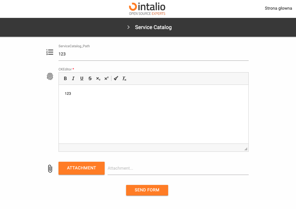](https://docs.intalioservices.com/uploads/images/gallery/2022-09/IAuSPDR8tdhRdaJX-image-1662717974033.png) **ON** [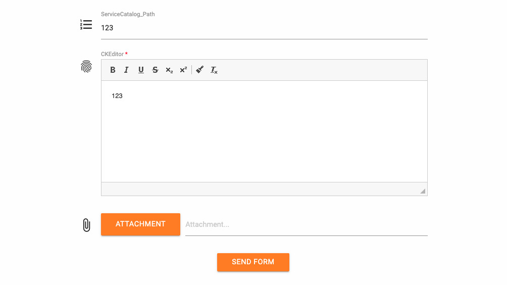](https://docs.intalioservices.com/uploads/images/gallery/2022-09/j0LZiGX3pVwMUZsU-image-1662718026419.png) # Form configuration - virtual panels [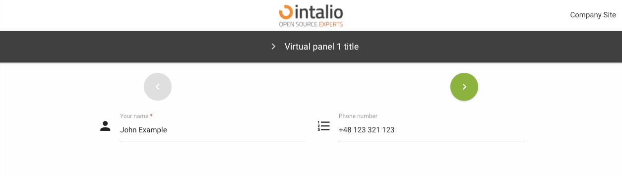](https://docs.intalioservices.com/uploads/images/gallery/2020-05/FYA382NYZZGLjBlW-image-1590396481603.png) Virtual panels allow, for example, to separate thematic sections. If your form is long, you can use virtual panels to separate it into smaller sections. If there is one virtual panel in your configuration, the form will be displayed normally. If you add more, additional buttons will appear at the top of the page to navigate through the virtual panels.Remember to add a button on the last panel allowing you to send the form!
After filling in the form and pressing the send button (or if there is an error before sending), all panels will be merged for easier verification. **Example:** ```JSON { "default_lang": "en", ... "panels": [ { "name": "Panel 1 TITLE", "fields": [ { //Field1 }, { //Field2 }, ] }, { "name": "Panel 2 TITLE", "fields": [ { //Field3 }, { //Field4 }, ] }, { "name": "Panel 3 TITLE", "fields": [ { //Field5 }, { //Send Button }, ] }, } ``` # Form configuration - fields # Attributes available for each field Each form must have some fields :D Dynamic forms allow you to create multiple field types. Each form field has a set of standard configurations. Additionally, fields can contain their own configurations. These are settings that you can activate in any field. ### size The size of the field is defined on the basis of blocks, divide the screen into 12 parts and determine the size of the field "filling in these parts".12 will set the field size for the whole screen, 6 will set the field size for half the screen. Screen sizes are defined by the letters **s,m,l (small, medium, large)**. Setting s12 m6 l3 will set the value 12 for small screens, 6 for medium screens and 3 for large screens.size: s12 m6
[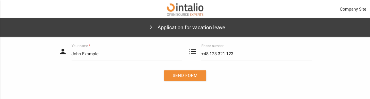](https://docs.intalioservices.com/uploads/images/gallery/2020-05/Zu1EmwDMjhvnYpNo-image-1590144046709.png)[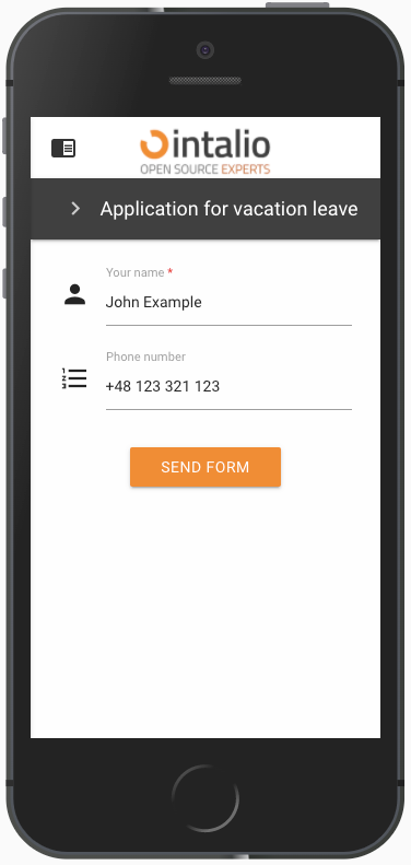](https://docs.intalioservices.com/uploads/images/gallery/2020-05/ybpUslyR05tiLbQa-image-1590144137570.png) ### type Field type, here we enter the specific field type you want to use e.g. select, text. ### id field identifier.This value must be unique and must not contain spaces!
### tooltip When you hover over the field, a balloon will pop up, displaying any text or HTML. [](https://docs.intalioservices.com/uploads/images/gallery/2020-05/j3NTSomnXSfjBXaA-image-1590147190230.png) ### label Here you can enter the field title e.g. "Your name". ### validate Here we can enter a list of any field validations (we can also create our own regex). An example of a validator is "required". ```JSON //example "validate": ["required", "email"] ``` #### Available validators **after** **alpha** - The field under validation may only contain alphabetic characters. **alpha\_dash** - The field under validation may contain alphabetic characters, numbers, dashes or underscores. **alpha\_num** - The field under validation may contain alphabetic characters or numbers. **alpha\_spaces** - The field under validation may contain alphabetic characters or spaces. **before** - The field under validation must have a numeric value bounded by a minimum value and a maximum value. **between** - The field under validation must have a numeric value bounded by a minimum value and a maximum value. **confirmed** - The field under validation must have the same value as the confirmation field. **credit\_card** **date\_between** **date\_format** **decimal** **digits** - The field under validation must be numeric and have the specified number of digits. **dimensions** - The file added to the field under validation must be an image (jpg,svg,jpeg,png,bmp,gif) having the exact specified dimension. **email** - The field under validation must be a valid email. **ext** - The file added to the field under validation must have one of the extensions specified. **image** - The file added to the field under validation must have an image mime type (image/\*). **in** **integer** - The field under validation must be a valid integer value. Doesn't accept exponentiale notation. **ip** **is** - The field under validation must match the given value, uses strict equality. **is\_not** - The field under validation must not match the given value, uses strict equality. **length** - The field under validation must have exactly have the specified number of items, only works for iterables. **max** - The field under validation length may not exceed the specified length. **max\_value** - The field under validation must be a numeric value and must not be greater than the specified value. **mimes** - The file type added to the field under validation should have one of the specified mime types. **min** - The field under validation length should not be less than the specified length. **min\_value** - The field under validation must be a numeric value and must not be less than the specified value. **not\_in** **numeric** - The field under validation must only consist of numbers. **regex** - The field under validation must match the specified regular expression. **required** - The field under validation must have a non-empty value. By default, all validators pass the validation if they have "empty values" unless they are required. Those empty values are: empty strings, `undefined`, `null`, empty arrays. **size** - The file size added to the field under validation must not exceed the specified size in kilobytes. **url**Parameters to attributes should be separated by ":" e.g. **digits:11** - means 11 numbers allowed.
### icon Field icon. We can set any Material Design compatible icons here.[https://material.io/resources/icons/?style=baseline](https://material.io/resources/icons/?style=baseline)
### hidden Field display.A field that is hidden still exists on the form (but is invisible) its values can be sent!
### disabled Field is disabled. ### otrs\_visible Here we specify where the field is to be added.default: article
#### `article` The field will be added to the article. #### `dynamicfield` The field will be added where dynamic fields are displayed.Remember that if the field will have an identifier that matches the dynamic field in OTRS, but will not have this value set - it will not be added as a dynamic field!
#### `all` The field will be added both as a dynamic field (*if the identifier matches the field in OTRS*), and will be added to the note. #### `none` The field will not be added anywhere. #### `file` ### placeholder Default value displayed in the field as a placeholer ### value Default field value. Here we can enter, for example, the default value of a selected item from the list or any other thing we want to complete by default on the form.This value can be changed by the user while filling in the form - unless the field is disabled or hidden.
### api API mechanism allows you to edit any attributes of each field (after the data is loaded, it will be automatically refreshed and the view will be re-rendered). The API mechanism was created so that data from external systems can be entered into the forms. Using api, you can change any field parameter at any time when using the form. Usually the field "api" is used for normal downloading of data from external systems. For example, if you want to enter a default value when downloading from another system, just enter the address of the endpoint, which will return the data in the appropriate format. The address will be queried as soon as the form is loaded.Option "api\_watcher" allows for more advanced actions.
Example: *The field is hidden by default and if it succeeds in getting data from the API it will be shown and its value will change to "New Value from API!"* *Our API is available at [https://example.intalio.pl](https://example.intalio.pl)* ```JSON { "size": "s12 m12", "type": "text", "max": 13, "id": "ExampleFieldID", "label": "Example field Label", "icon": "confirmation_number", "validate": [ "required" ], "hidden": true, "value": "", "api":"https://example.intalio.pl" }, ``` *Response:* ```JSON { "hidden": false, "value": "New Value form API!" } ```This way we can change any parameter of each field.
### api\_watcher Okay, not always easy is the best. That's why we created "api\_watcher." This mechanism allows you to listen to changes in any fields and then send this information to any API. This parameter allows you to complete the current field with data that are dependent on another field. For example: Directory of services - you choose "Hardware repair", and in the next step you choose the name of a specific item, e.g. "Computer repair". To make such a form, the detailed field ("Repairing the computer") must listen for changes in the general field "Hardware repair". If there is any change in the general field - the detail field will ask the API and update its data. *Configuration:* ```JSON { "size": "s12 m12", "type": "text", "max": 13, "id": "ExampleFieldID", "label": "Example field Label", "icon": "confirmation_number", "validate": [ "required" ], "hidden": true, "value": "", "api_watcher": { "delay_api": "", "fields": [ { "field_id": "ExampleField_Main", "api": "https://example.intalio.pl?DynamicFormField=${value}&lang=${LANG}" } ] } }, ```As you can see in the example above, the "api\_watcher" mechanism allows you to paste the value received from the listened field anywhere. Add **${value}** anywhere in the URL and the data will be pasted there. The currently loaded language will appear in place **${LANG}**
#### Using **${value}** This is the key where the value from the listening field will appear. #### Using ${LANG} If your system is to support multiple languages, the API must also do it. To send the currently running form language to the API, you can add this parameter. #### fields "fields" is an array that can contain any number of fields for which the current field is to listen. ##### field\_id This is where you type the field identifier you want to listen to. ##### api The address to be called after changing the data in the listening field. ### api\_add\_lang Do you include the variable ${LANG} and insert the currently selected language in its place ### add\_session\_id\_to\_api If you want to send a user session to the API, you can do so by activating this parameter. If it is activated, the system will automatically attach the sessionId parameter to each request.If you want to authorize users or have access to user data via session, you must use this parameter.
### pdf (>=1.2.20) The **pdf** parameter allows you to control how a field is rendered in the generated PDF document. This configuration affects only the PDF output and does not change the behavior of the field on the form.The PDF configuration is read dynamically using **getFieldProperties(fieldId)**.
[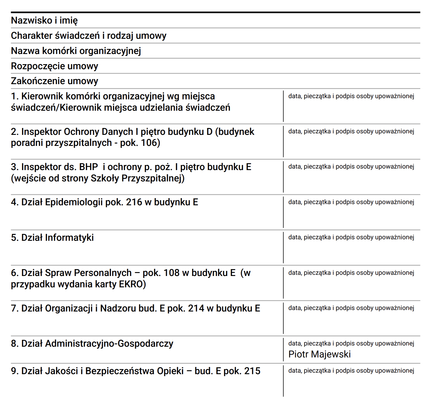](https://docs.intalioservices.com/uploads/images/gallery/2026-03/RYdrMGywGYnhUui4-image.png) #### signature If **signature** is set to `true`, the answer column in the PDF will be internally divided into two parts: - Left side – field value - Right side – signature area (separated by a vertical line) If this parameter is not set or equals `false`, the field is rendered normally. #### signatureLabel Text displayed above the signature area.Default value: **"Podpis"**
#### signatureText If provided, this text will be displayed instead of an empty signature line. This option is useful when confirmation is generated electronically and no manual signature is required. **Example use cases:** - Approved - Not applicable - Electronically confirmed #### print If set to `false`, the field will not be included in the generated PDF.Default value: **true**
#### PDF rendering behavior The main PDF table remains two-column: **Question | Answer** Only fields that have `pdf.signature = true` will have the Answer column internally divided into: **Answer | Signature** Other fields remain unchanged. #### Example configuration[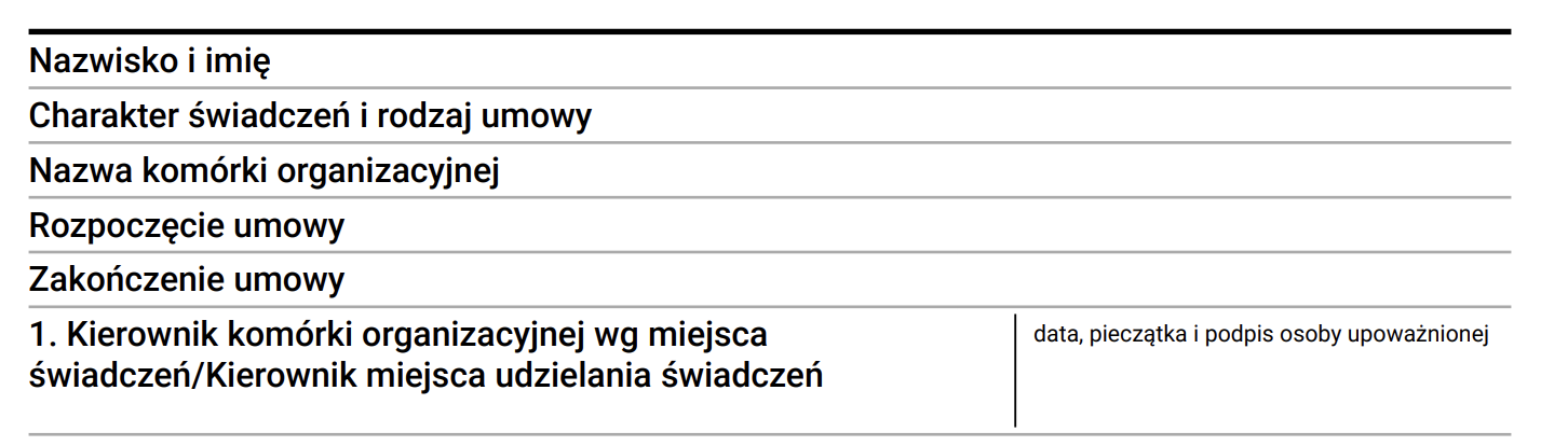](https://docs.intalioservices.com/uploads/images/gallery/2026-03/RoJjIykGxVmUovok-image.png) ```json { "size": "s12 m6", "type": "text", "id": "ApprovalField", "label": "Approval", "hidden": false, "value": "", "pdf": { "signature": true, "signatureLabel": "Signature" } } ``` #### Example with automatic confirmation text [](https://docs.intalioservices.com/uploads/images/gallery/2026-03/UwUuYUYSRwuPdKtd-image.png) ```JSON { "size": "s12 m6", "type": "text", "id": "StatusField", "label": "Status", "hidden": false, "value": "", "pdf": { "signature": true, "signatureText": "Electronically approved" } } ``` # Button ## Button (button) **download PDF** *example*: ```JSON { "mode": "PDF", "pdf_action":"download", "question_label": "{questionLabel}", "answer_label":"{answerLabel}", ... } ``` **submit form** *example*: ```JSON { "mode":"submit" ... } ``` **clone fields** *example*: ```JSON { "mode": "clone", "clone_additional_shift": -1, "clone_fields": [ { "id": "textField1" }, { "id": "textField2" } ], ... } ``` ### mode #### submit This mode allows you to send a form. It has no additional configuration options. #### #### clone (beta) [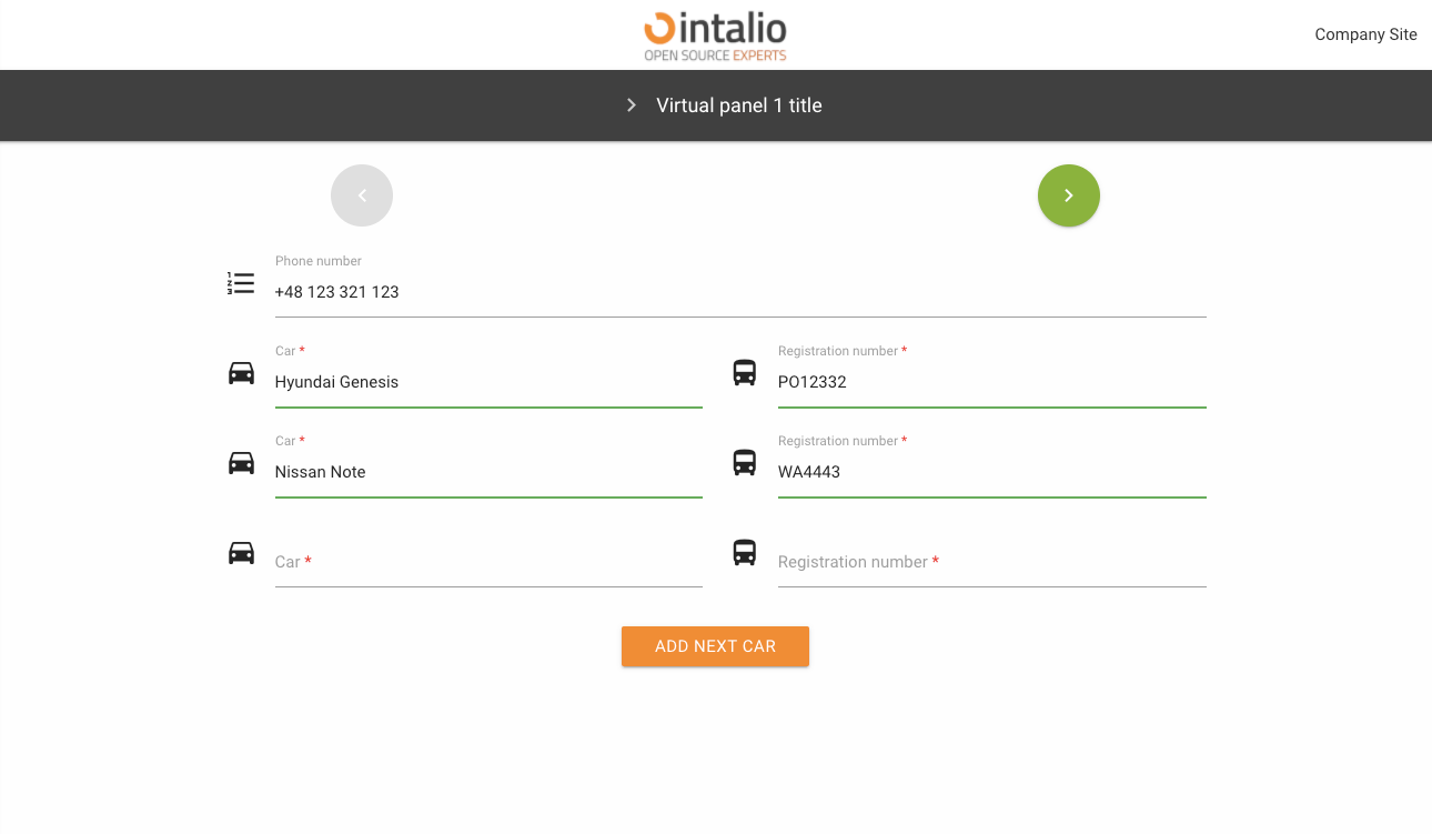](https://docs.intalioservices.com/uploads/images/gallery/2020-05/QTpm09FugDUIfA22-image-1590410169909.png) This mode was created so that any number of fields can be copied. Imagine you are creating a form where someone has to add their cars (we don't know how many cars there are).Thanks to this solution, the person filling in the form can click the button to copy any number of fields.
Field identifiers will be generated according to the following pattern: *field name \_ clone number \_ internal number*
**Full example:** ```JSON { "size": "s12 m6", "type": "text", "id": "carModel", "label": "Car", "icon": "drive_eta", "validate": [ "required" ], "hidden": false, "value": "" }, { "size": "s12 m6", "type": "text", "id": "carType", "label": "Registration number", "icon": "directions_bus", "validate": [ "required" ], "hidden": false, "value": "" }, { "size": "s12 m12 center", "type": "button", "id": "clone_btn", "mode": "clone", "label": "Add next car", "clone_additional_shift": -2, "clone_fields": [ { "id": "carModel" }, { "id": "carType" } ] } } ``` ##### clone\_additional\_shift Where are the new cloned fields to appear. Enter the number of fields from the button e.g. -1, then the fields will appear before the button.The mechanism takes both positive and negative numbers.
##### clone\_fields List of cloned fields. Here you give a list with the ID of the fields you want to copy. #### PDF [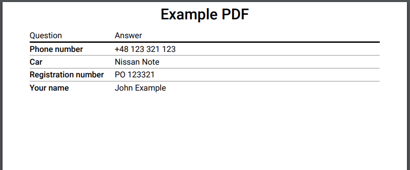](https://docs.intalioservices.com/uploads/images/gallery/2020-05/7xWs43bpMCPapNfG-image-1590411076866.png) The PDF field allows you to generate a PDF printout of the entire form. You can download the file, print it or just open it in a new tab.To generate a PDF file, you must have a field with the id "OTRS\_Ticket\_Title" this field will be set as the print title.
##### pdf\_action In this parameter you set what should happen to the generated file, you have several options available: - open - print - download ##### question\_label title of the first column of the resulting file. ##### answer\_label the title of the second column of the resulting file. #### redirect The redirection button. When you click it will take you to any other site. ##### redirect\_type Type of redirection, available: - **newWindow** - redirection to the address in the new tab - **redirect** - redirection in the current card ##### redirect\_url An address to redirect. ##### *version >= 1.2.9* The system allows you to add the `SessionID` and `LANG` parameter to the url (the parameters are automatically set based on the current. ``` { "size": "s12 m12 center", "type": "button", "id": "redirect_with_session", "mode": "redirect", "label": "Redirect with session", "redirect_type": "newWindow", "redirect_url": "https://google.pl?SessionID=${SessionID}&lang=${LANG}" } ``` *Such a setting will redirect to the following link:* https://google.pl?SessionID=123123&lang=en ### ### The rest of the available parameters:This field supports all parameters with ["Attributes available for each field".](https://docs.intalioservices.com/books/dynamic-forms---installation-and-administrators-guide/page/attributes-available-for-each-field "Attributes available for each field")
# Checkbox ## Checkbox (checkbox) This field, which someone can select, appears in two versions - as a single field (e.g. for approval of a contract), or as a set of fields. [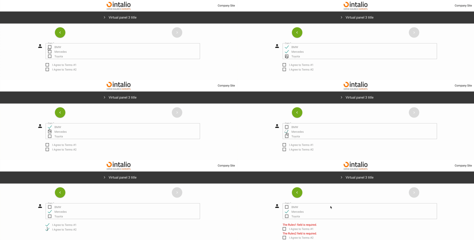](https://docs.intalioservices.com/uploads/images/gallery/2020-05/7lu6fGjUKIwwrLZS-image-1590572241142.gif) ### options\_style Here you can determine how the layout of the fields should look like (if you have more than one field).For more information on what you can type in here, please see the Responsibility section.
### define\_output\_value Is the value that goes into the output system to be taken from the label or value parameter. ### show\_one\_as\_fieldset (1.2.2) show\_one\_as\_fieldset = true [](https://docs.intalioservices.com/uploads/images/gallery/2021-11/2BNuQDaMdDGPD7xk-image-1636981743097.png) show\_one\_as\_fieldset = false [](https://docs.intalioservices.com/uploads/images/gallery/2021-11/2WvWL7ICHaJI8M3U-image-1636981775754.png) If we have one value and we still want to display it as fieldset. ### options All available options. #### value #### label #### checked Check if you want this option to be selected by default. #### disabled Check if you want this option to be inactive by default. ### The rest of the available parameters:This field supports all parameters with ["Attributes available for each field".](https://docs.intalioservices.com/books/dynamic-forms---installation-and-administrators-guide/page/attributes-available-for-each-field "Attributes available for each field")
# Radio ## Radio (radio) This field allows you to select one of the available fields. [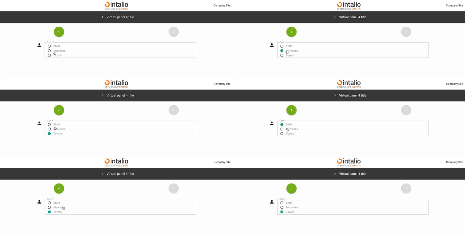](https://docs.intalioservices.com/uploads/images/gallery/2020-05/sJoK9yDjDhykc7Q4-image-1590572469846.gif) ### options\_style Here you can determine how the layout of the fields should look like.For more information on what you can type in here, please see the *\[responsive section\]*.
### define\_output\_value Is the value that goes into the output system to be taken from the label or value parameter. ### options All available options. #### value #### label #### checked Check if you want this option to be selected by default. #### disabled Check if you want this option to be inactive by default. ### The rest of the available parameters:This field supports all parameters with ["Attributes available for each field".](https://docs.intalioservices.com/books/dynamic-forms---installation-and-administrators-guide/page/attributes-available-for-each-field "Attributes available for each field")
# CompareField ## CompareField (comparefield) A compareField is a field that allows you to combine values from multiple fields. Thanks to this field you can combine several fields into one and send as e.g. request title. *example:* ```JSON { "fields": [ { "id": "checkBoxField" }, { "id": "textField" } ], "output": "${textField} <-> ${checkBoxField}" } ```This field has no view, it is a virtual field!
*For example:* We have two fields "First name" and "Last name", we want these values to be sent as one field, e.g. the title of the request, and we also want to add "Your name:". ```JSON { "fields": [ { "id": "UserFirstName" }, { "id": "UserLastName" } ], "output": "Your Name: ${UserFirstName} ${UserLastName}" } ``` Our fields:[](https://docs.intalioservices.com/uploads/images/gallery/2020-05/GbXC8189SoGn9OgQ-image-1590489835623.png) [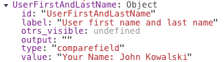](https://docs.intalioservices.com/uploads/images/gallery/2020-05/0VwB4uCmr6YK1ur7-image-1590489849932.png)Field of type "compareField" had the identifier set to "UserFristNameAndLastName". Its output value was "Your Name: John Kowalski".
### Use of variables:To combine the values of several fields, place the identifiers of these fields in two places.
First, you need to activate a field in the "fields" parameter, and then determine in what form you want this field to be displayed by adding it to the "output" parameter. In the output parameter you only need to use the following sequence ${field identifier}, the rest depends on your imagination. ### The rest of the available parameters:This field supports all parameters with ["Attributes available for each field".](https://docs.intalioservices.com/books/dynamic-forms---installation-and-administrators-guide/page/attributes-available-for-each-field "Attributes available for each field")
# SelectField ## SelectField (select) This field allows you to display a list.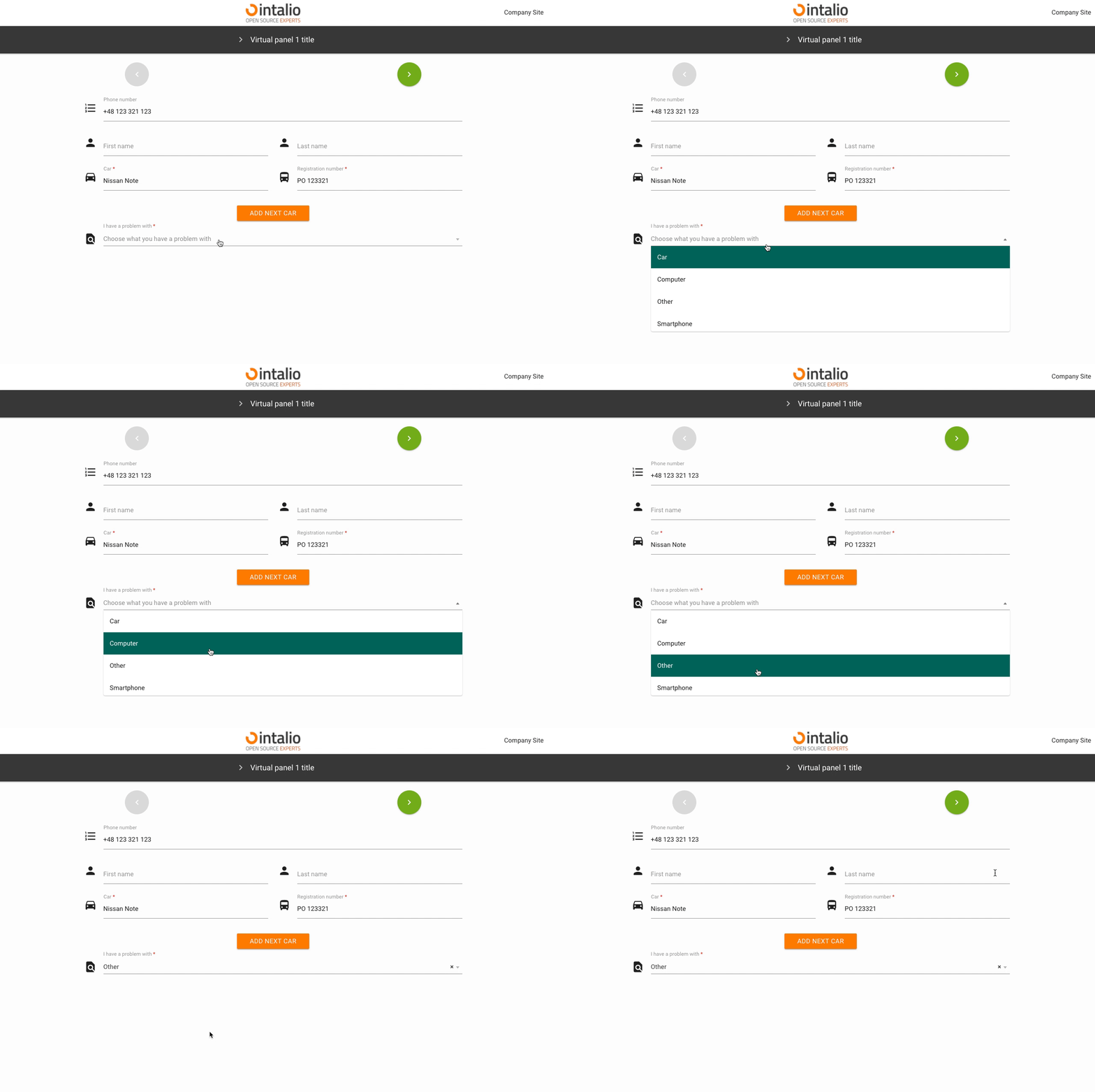Remember, if you don't want the first option to be checked by default, you must add an empty first option!
#### value Field value. #### label Field label. #### checked Should the field be selected by default. #### disabled Is the field to be inactive by default. ### api\_dynamicAdded in version **1.0.24**
[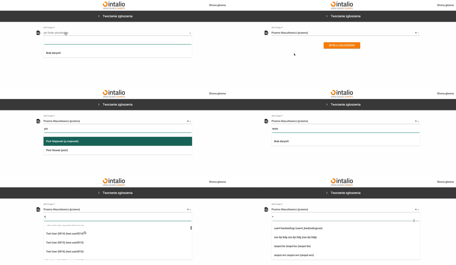](https://docs.intalioservices.com/uploads/images/gallery/2021-05/QmJzNt9CkxxKJIok-image-1620142849407.gif) This field allows you to search the api dynamically.This field supports all other api attributes (e.g. add\_session\_id\_to\_api)
**Response:**This field supports all parameters with ["Attributes available for each field".](https://docs.intalioservices.com/books/dynamic-forms---installation-and-administrators-guide/page/attributes-available-for-each-field "Attributes available for each field")
# DateTime ## DateTime (datetime) [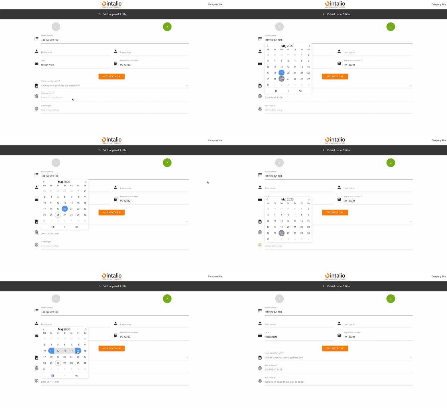](https://docs.intalioservices.com/uploads/images/gallery/2020-05/erpAH4uqVmu3rW4l-image-1590497491784.gif) Example: ```JSON { "size":"s12 m12", "type":"datetime", "id":"ExampleID", "label":"Example Label", "validate":[ "" ], "icon":"person", "hidden":false, "datetime_config":{ "locale":"English", "enableTime":false, "mode":"range", "time_24hr":true, "dateFormat":"Y-m-d H:i:00", "altInput":true, "altFormat":"Y-m-d H:i" ``` ### datetime\_config The date and time component is very extensive. The whole configuration in this case is in "datetime\_config" and is passed directly to the component. ### locale Calendar language ### enableTime If you want the calendar to also display a component for time selection, you must have this option checked. ### time\_24hr 24-hour date format. ### dateFormat Output format, you can determine whether you want to send the day, month, year, hour, minute or you want to format it completely different.This is an output format not shown on the screen! To change the format of the data displayed on the screen, use "altInput".
[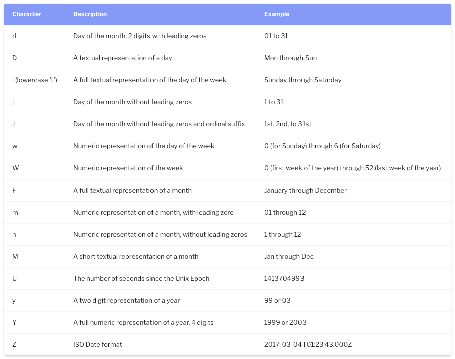](https://docs.intalioservices.com/uploads/images/gallery/2020-05/yNYTiqpIV1YKbNwF-image-1590498552766.png) ### altInput Do you run an alternative date display. ### altFormat Alternative date display, i.e. the outgoing date will be formatted on the basis of "dateFormat", but will be displayed on the basis of "altFormat" ### noCalendar Display only the component responsible for the time. ### mode Calendar mode. You can set whether someone should select a single date, a date range or whether they can select several independent dates. #### none A simple action. [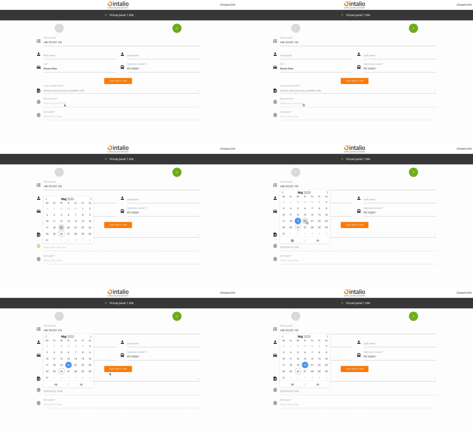](https://docs.intalioservices.com/uploads/images/gallery/2020-05/MmIBLbDBLouge2pk-image-1590501699889.gif) #### multiple Multiple date selection. [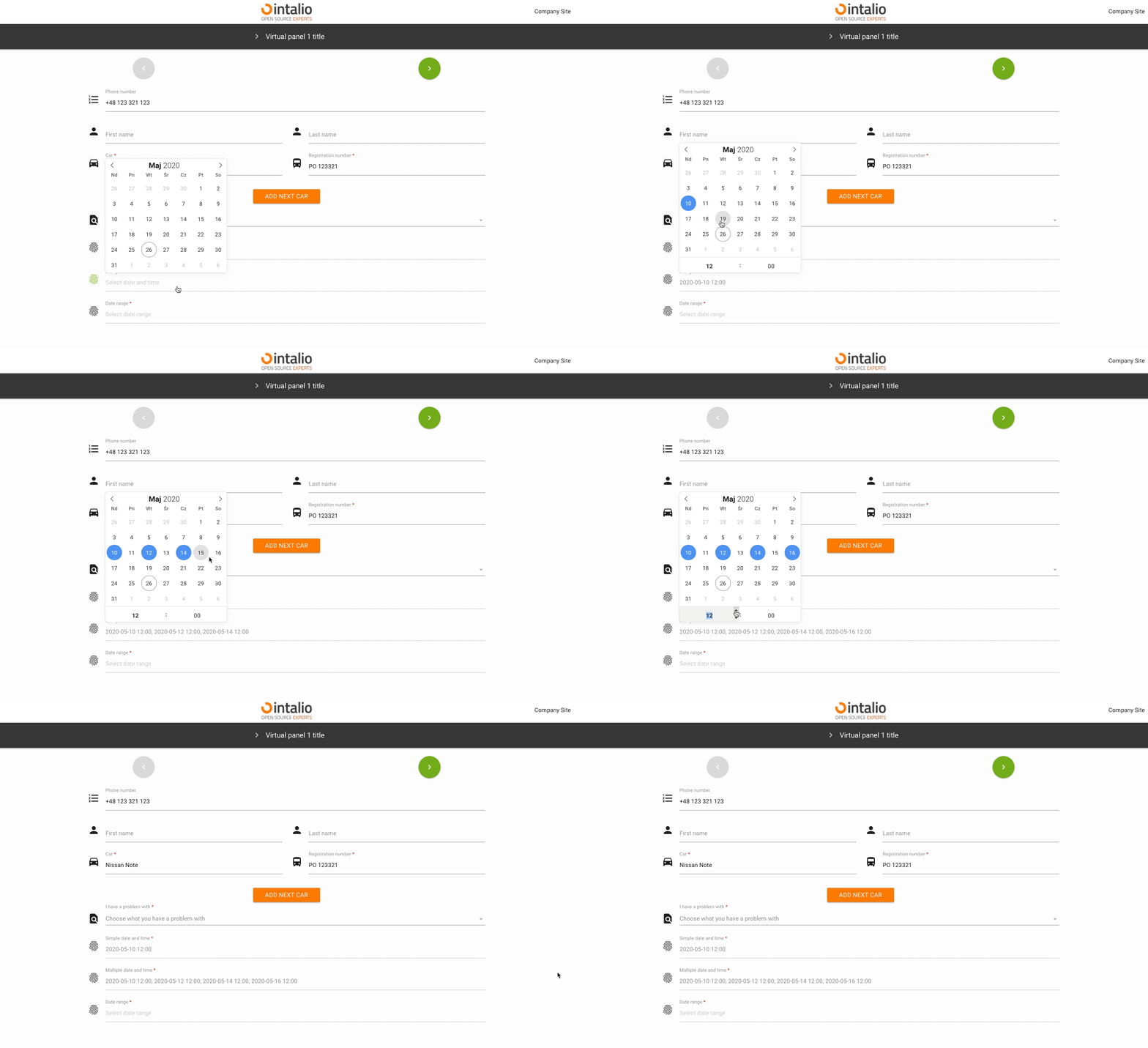](https://docs.intalioservices.com/uploads/images/gallery/2020-05/ORGNLIN8n34zUj8n-image-1590502680596.gif) #### range Selectable date range. [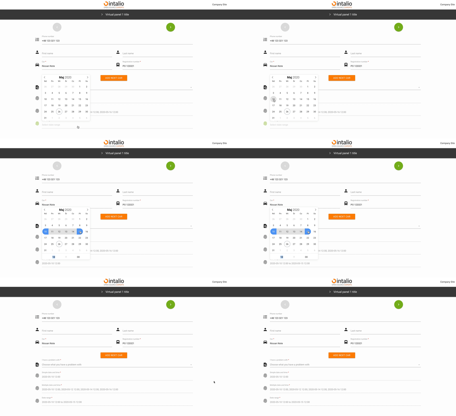](https://docs.intalioservices.com/uploads/images/gallery/2020-05/DcEKrIZEGlvw1rSC-image-1590502727262.gif) ### enable Add the ability to select dates only from specific date ranges. #### from #### to ### The rest of the available parameters:This field supports all parameters with ["Attributes available for each field".](https://docs.intalioservices.com/books/dynamic-forms---installation-and-administrators-guide/page/attributes-available-for-each-field "Attributes available for each field")
[FlatPickr options](https://flatpickr.js.org/options/)
# ImgButton - Image button - Extended HUB ## ImgButton (imgbutton) [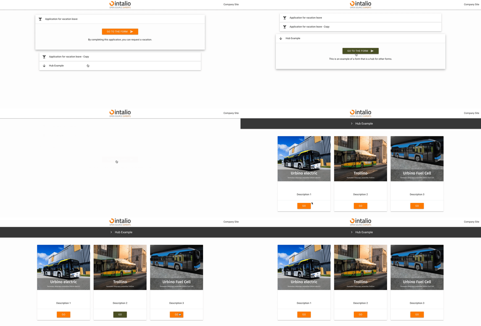](https://docs.intalioservices.com/uploads/images/gallery/2020-05/DnRJlojSKfNxcCJH-image-1590504886026.gif) The "ImgButton" mechanism allows you to create graphic buttons. You can use them to create e.g. another dashboard in the style "from general to specific". If your system is going to have a lot of forms, you can create a lot of dashboards with buttons that will direct you to the next dashboards.This element may or may not have a picture.
*Example:* ```JSON { "size": "s12 m4", "type": "imgbutton", "id": "ImgButton3", "otrs_visible": "all", "label": " ", "validate": [ "required" ], "hidden": false, "image": "/static/img/bus/fuel_cell.jpg", "title": " ", "description": "Description 3", "redirect": "FuelCellConsultations.json", "redirect_text":"Go" } ``` ### image Image url. The image may be on the server or somewhere outside the server.Remember that all additional elements must be in the static directory, only then they will be available at the url.
### title Text displayed on the button. ### description The description that will be displayed above the redirection button. ### redirect The address to which you want to redirect.Here you can enter the file name of the next form e.g. "example1.json".
### redirect\_text Text displayed on the redirection button. ### The rest of the available parameters:This field supports all parameters with ["Attributes available for each field".](https://docs.intalioservices.com/books/dynamic-forms---installation-and-administrators-guide/page/attributes-available-for-each-field "Attributes available for each field")
### # HTML/FAQ ## HTML/FAQ (faq) [](https://docs.intalioservices.com/uploads/images/gallery/2020-05/weqYvwJob3QUWuco-image-1590573288624.png) Field of type "faq" allows to render any html code. You can use it, for example, to search for duplicate tickets and inform the person filling in the form that such a ticket already exists in the system (just use "faq" field with API running). ```JSON { "hidden": false, "value": "" } ```In fact, whatever appears in the "value" field will be rendered, you can use this field to separate e.g. sections of the form or to display images.
### Example - knowledge base: ```JSON { "size": "s12 m12", "type": "faq", "id": "FAQ1", "label": "Infos from knowledge base", "validate": [ "" ], "icon": "help", "hidden": true, "value": "No data...", "background_color": "#f5f5f5", "api_add_lang": true, "api_watcher": { "delay_api": "", "fields": [ { "field_id": "Field_with_problem", "api": "http://otrs.intalio.pl/otrs/knowledge-base-api.pl?Query=${value}" }, { "field_id": "A_field_to_describe_the_problem", "api": "http://otrs.intalio.pl/otrs/knowledge-base-api.pl?Query=${value}" } ] }, ``` ### background\_color The background color of the field. ### The rest of the available parameters:This field supports all parameters with ["Attributes available for each field".](https://docs.intalioservices.com/books/dynamic-forms---installation-and-administrators-guide/page/attributes-available-for-each-field "Attributes available for each field")
# CKEditor ## CKEditor (ckeditor) [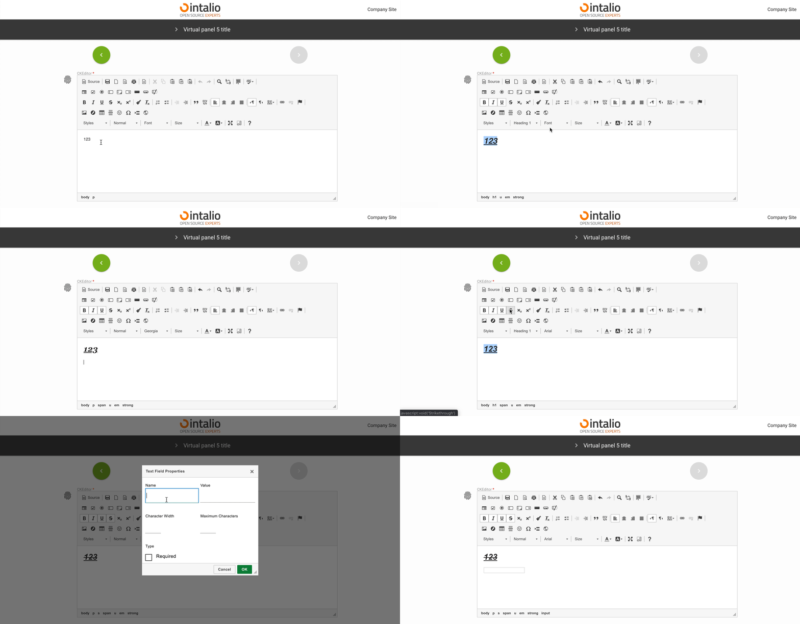](https://docs.intalioservices.com/uploads/images/gallery/2020-05/i9hHyemDh5s2Dv21-image-1590576491342.gif) The CKEditor field allows you to display an advanced text editor. This editor can be configured according to the CKEditor documentation. *Example:* ```JSON { "size": "s12 m12", "type": "ckeditor", "id": "ckEditor", "label": "CKEditor", "validate": [ "required" ], "icon": "fingerprint", "hidden": false, "value": "Your text...", "config": { "language": "en" } } ``` ### config Here you can use all available ckeditor settingsYou can set up a lot of items that you will find in the official CKEditor documentation. An example parameter is **language**, which will change the language of the text editor.
[](https://docs.intalioservices.com/uploads/images/gallery/2020-05/wOZcFWcBtfin4kac-image-1590583026488.png)CKEditor docs: [https://ckeditor.com/docs/ckeditor4/latest/](https://ckeditor.com/docs/ckeditor4/latest/)
### ### The rest of the available parameters:This field supports all parameters with ["Attributes available for each field".](https://docs.intalioservices.com/books/dynamic-forms---installation-and-administrators-guide/page/attributes-available-for-each-field "Attributes available for each field")
# File - File picker ## File picker (file) [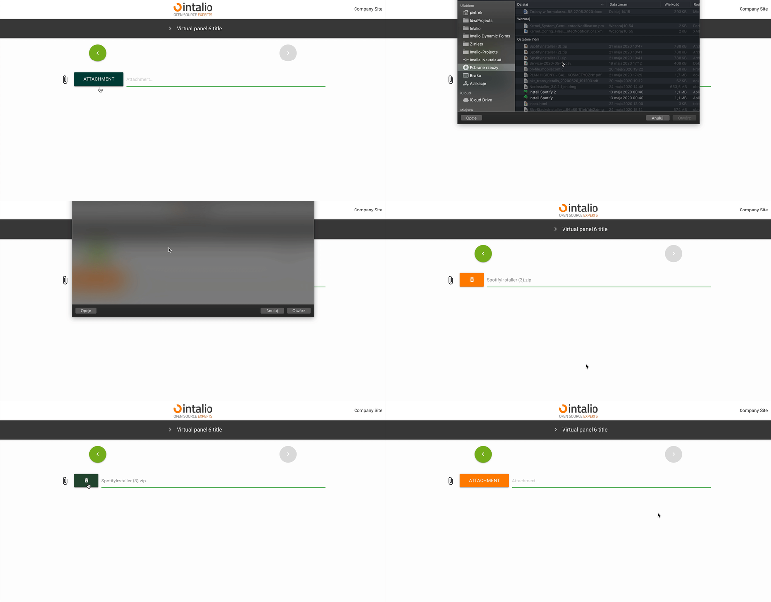](https://docs.intalioservices.com/uploads/images/gallery/2020-05/PvicRlvZqMMgTzUE-image-1590583561393.gif) If you want to upload a file to the system, you can do so using the "file" field. Just add such a field to the form and you will be able to send any file.If you want to send several files, you can add several fields.
### ### The rest of the available parameters:This field supports all parameters with ["Attributes available for each field".](https://docs.intalioservices.com/books/dynamic-forms---installation-and-administrators-guide/page/attributes-available-for-each-field "Attributes available for each field")
# Text ## Text (text) This field allows you to enter text. [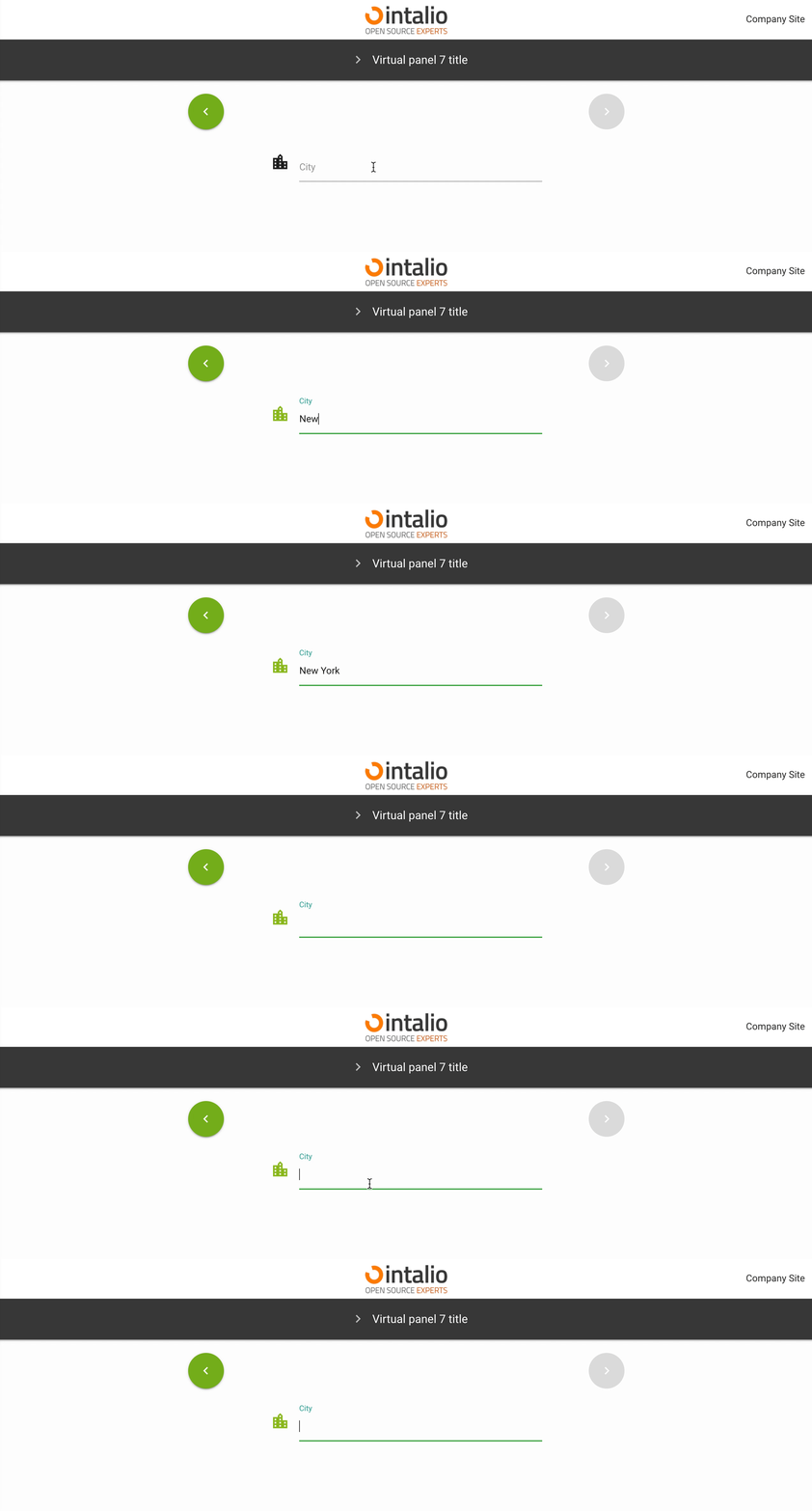](https://docs.intalioservices.com/uploads/images/gallery/2020-05/z8GELlNz5Bbu5bnK-image-1590585969531.gif) ```JSON { "size": "s12 m6 offset-m3", "type": "text", "id": "SelectCity", "label": "City", "validate": [ "" ], "icon": "location_city", "otrs_visible": "all", "hidden": false, "value": "" }, ``` ### The rest of the available parameters:This field supports all parameters with ["Attributes available for each field".](https://docs.intalioservices.com/books/dynamic-forms---installation-and-administrators-guide/page/attributes-available-for-each-field "Attributes available for each field")
# Textarea ## Textarea (textarea) [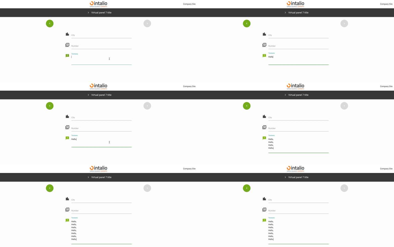](https://docs.intalioservices.com/uploads/images/gallery/2020-05/MdkWmQh3IgG9JMHg-image-1590656661211.gif) This field allows you to enter longer texts. Its size is determined dynamically based on the amount of text. *Example:* ```align-left { "size": "s12 m6 offset-m3", "type": "textarea", "id": "Textarea", "label": "Textarea", "validate": [ "" ], "icon": "announcement", "otrs_visible": "all", "hidden": false, "value": "" } ``` ### The rest of the available parameters:This field supports all parameters with ["Attributes available for each field".](https://docs.intalioservices.com/books/dynamic-forms---installation-and-administrators-guide/page/attributes-available-for-each-field "Attributes available for each field")
# Number ## Number (number) This field takes only numbers, you can use the validator to set e.g. ranges. [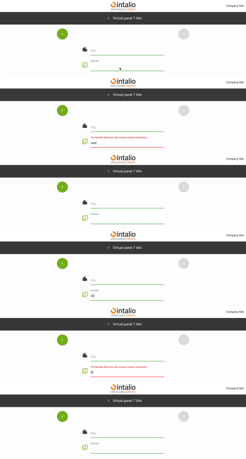](https://docs.intalioservices.com/uploads/images/gallery/2020-05/Hn14HxtVV0MvA0oQ-image-1590586494962.gif) *Example:* ```JSON { "size": "s12 m6 offset-m3", "type": "number", "id": "Number", "label": "Number", "validate": [ "" ], "icon": "filter_1", "otrs_visible": "all", "hidden": false, "value": "" } ``` ### The rest of the available parameters:This field supports all parameters with ["Attributes available for each field".](https://docs.intalioservices.com/books/dynamic-forms---installation-and-administrators-guide/page/attributes-available-for-each-field "Attributes available for each field")
# AdditionalForm ## AdditionalForm (additionalForm) (1.2.2) (BETA) This field allows you to dynamically load additional dynamic forms! [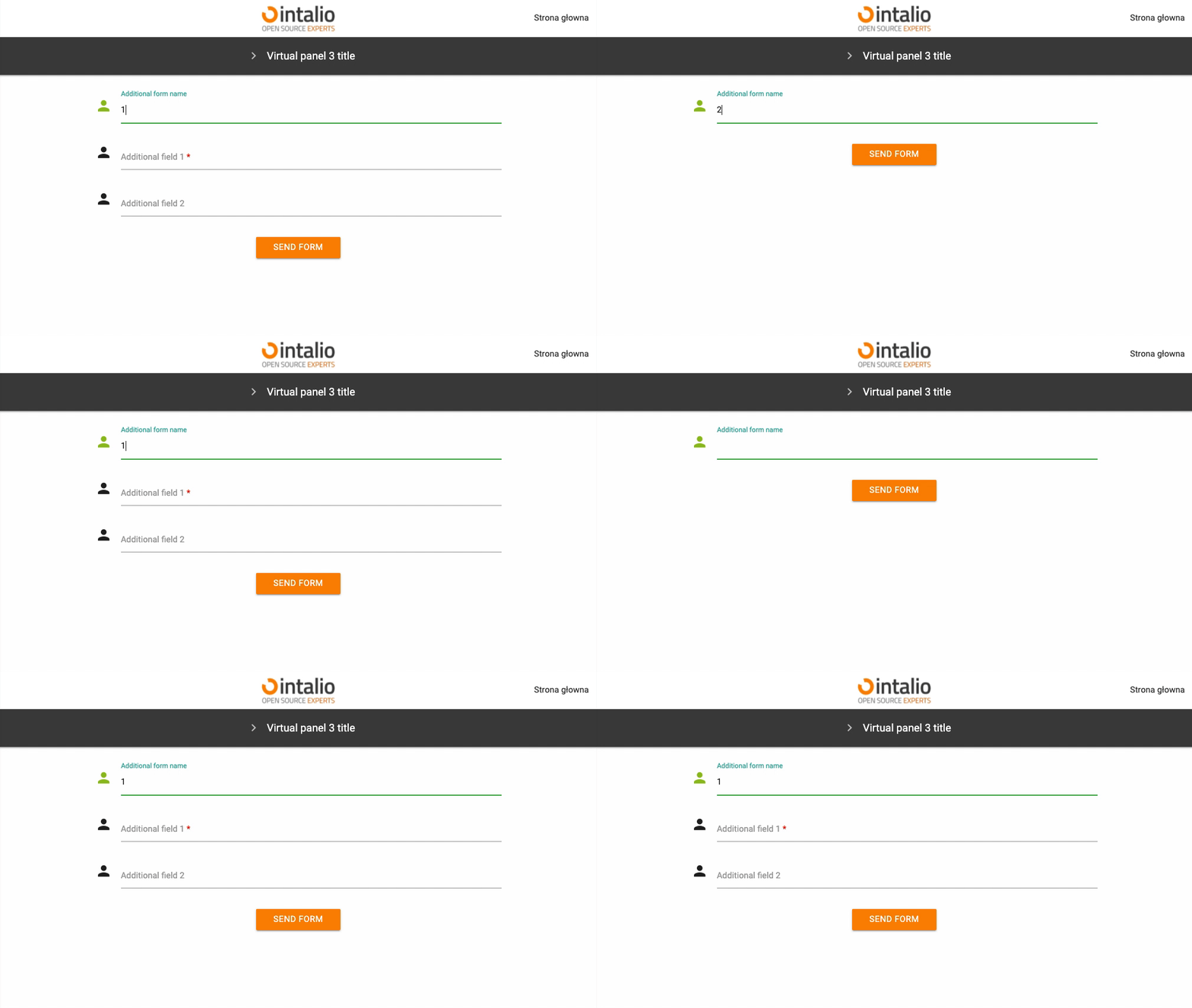](https://docs.intalioservices.com/uploads/images/gallery/2021-11/KbjgOfFcDOgxBfqK-image-1636544496589.gif) *Example:* ```JSON { "size": "s12 m12", "type": "additionalForm", "id": "additionalForm", "hidden": false, "value": "", "form_position": null, "additional_fields": null, "api_add_lang": false, "api_watcher": { "delay_api": "", "fields": [ { "field_id": "additionalFormName", "api": "/static/FORMS/API/additionalForms/additionalForm[${value}].json" } ] } } ``` ### Field requires 2 configuration options: #### additional\_fields ```json { "form_position": 9, "additional_fields": [ { "size": "s12 m12", "type": "text", "id": "additional_nazwaOperacji", "label": "Nazwa operacji", "icon": "person", "validate": [ "required" ], "hidden": false, "value": "" }, { "size": "s12 m12", "type": "text", "id": "additional_opisProblemu", "label": "Opis problemu", "icon": "subject", "validate": [ "required" ], "hidden": false, "value": "" }, { "size": "s12 m12", "type": "file", "id": "fileField", "label": "Załącznik", "validate": [ "" ], "icon": "attach_file", "placeholder": "Załącznik...", "hidden": false }, { "size": "s12 m12", "type": "file", "id": "fileField", "label": "Załącznik", "validate": [ "" ], "icon": "attach_file", "placeholder": "Załącznik...", "hidden": false }, { "size": "s12 m12", "type": "file", "id": "fileField", "label": "Załącznik", "validate": [ "" ], "icon": "attach_file", "placeholder": "Załącznik...", "hidden": false } ] } ``` #### form\_position index from which new fields are to be addedThe "additional\_form" mechanism is still in beta, so determining the order of the form may seem difficult. ...TODO...
### Use cases: For example, if any selection is to load an additional form from another file, we can use api\_watcher and the additionalForm field.Dynamically loaded forms currently do not support API dependencies.
### The rest of the available parameters:This field supports all parameters with ["Attributes available for each field".](https://docs.intalioservices.com/books/dynamic-forms---installation-and-administrators-guide/page/attributes-available-for-each-field "Attributes available for each field")
# Switch (>1.2.17) ## Switch (switch) `beta` This field allows you to set the value **true** or **false**. Allows advanced use when creating dynamic form logic. [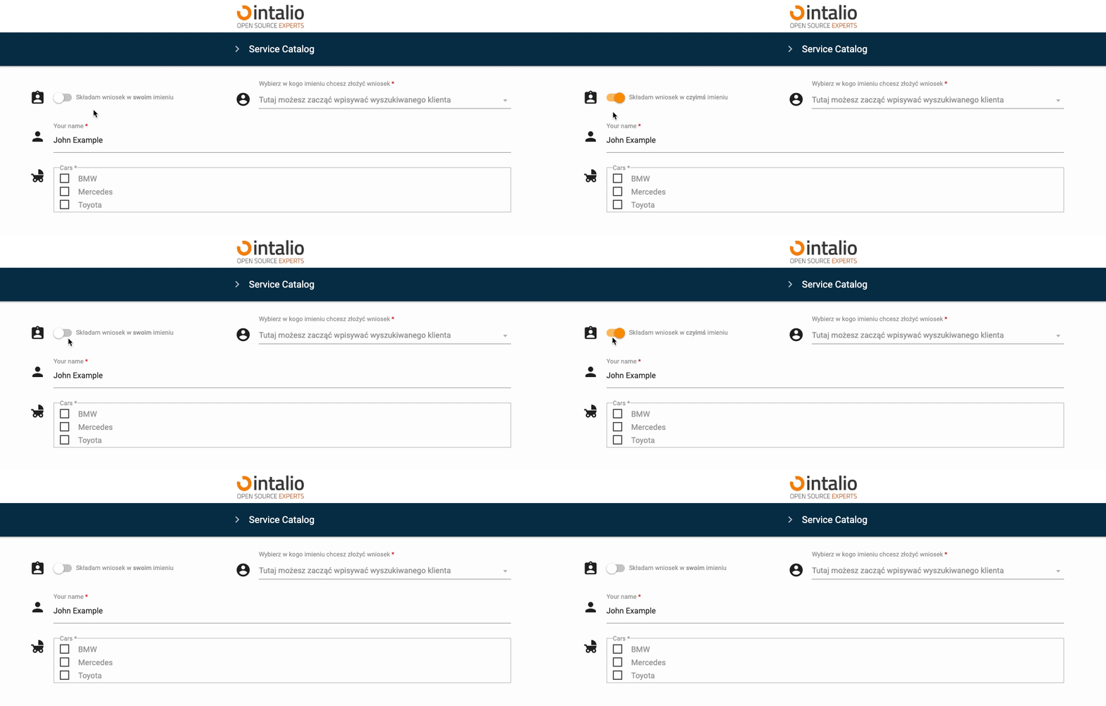](https://docs.intalioservices.com/uploads/images/gallery/2023-02/eu95Abw8NcAfz7g8-image-1676548009966.gif) ```JSON { "size": "s12 m5", "type": "switch", "id": "Switch", "hidden": false, "otrs_visible": "all", "order": 3, "tooltip": null, "icon": "assignment_ind", "icon_spacer": false, "label": null, "label_true": "Składam wniosek w czyimś imieniu", "label_false": "Składam wniosek w swoim imieniu", "validate": [], "disabled": false, "value": false }, ``` #### ## **Additional features** ### Icons You can add your own icon, you can not add an icon, but still keep the spacing, this will make your form more aesthetically pleasing. ##### ##### Default Turning on the icon shows one icon. ```JSON "icon": "assignment_ind", ``` [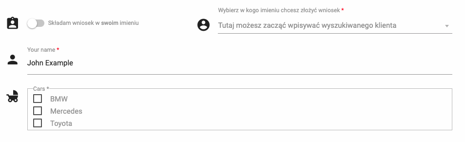](https://docs.intalioservices.com/uploads/images/gallery/2023-02/9mdsSGGi5sraKZwd-image-1676548455230.png) ##### ##### Without icon Disabling the icon will not display any icon or spacer. ```JSON "icon": null, ``` [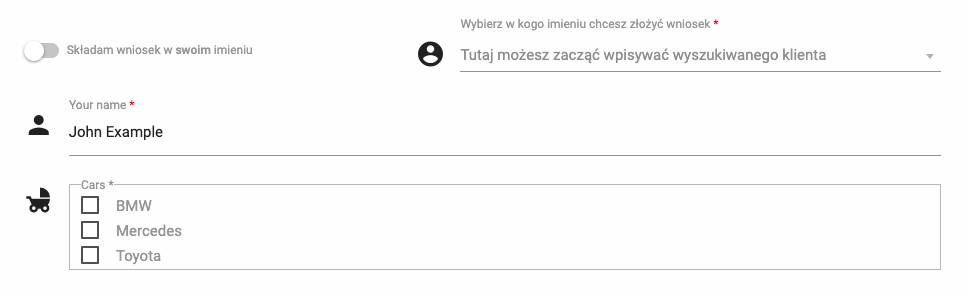](https://docs.intalioservices.com/uploads/images/gallery/2023-02/EkoCILlRd0IqcC7g-image-1676548496076.png) ##### ##### Without icon, but with spacer The system generates an automatic space in place of the icon. ```JSON "icon": null, "icon_spacer": true, ``` [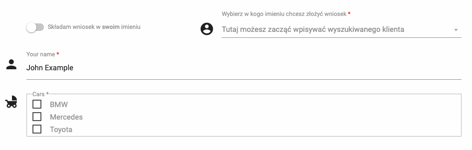](https://docs.intalioservices.com/uploads/images/gallery/2023-02/aIepyevANq3VZAVE-image-1676548540990.png) ### Labels This field allows you to define labels more precisely. We can enable the default label (as in any other field), but we can also set the content of the label depending on the state of the field. ##### ##### Default This is the default setting and behaves like any other field. [](https://docs.intalioservices.com/uploads/images/gallery/2023-02/uoHiGroYl4VI7ZO4-image-1676549443291.gif) ```JSON "label": "Składam wniosek w swoim imieniu", ``` ##### Dependent This setting will change the button's label depending on the current state. [](https://docs.intalioservices.com/uploads/images/gallery/2023-02/f3R0l658LXfU7uY7-image-1676549705853.gif)This parameter also accepts most html tags, e.g. <strong>
```JSON "label": false, "label_true": "Składam wniosek w czyimś imieniu", "label_false": "Składam wniosek w swoim imieniu", ``` ##### ##### Styles The color scheme of the button and its behavior can be customized in the configuration file found here: `/FORMS/styles/custom_style.css` [](https://docs.intalioservices.com/uploads/images/gallery/2023-02/lPPBbiDZvuqtBLs9-image-1676550224793.png)[](https://docs.intalioservices.com/uploads/images/gallery/2023-02/O3wItOJqJ0hPAfdS-image-1676550176028.png) ### The rest of the available parameters:This field supports all parameters with ["Attributes available for each field".](https://docs.intalioservices.com/books/dynamic-forms---installation-and-administrators-guide/page/attributes-available-for-each-field "Attributes available for each field")
# Additional information # Output data structure ```JSON { "options": { // Section "options" }, "data": { // Section "data" } } ``` #### Section "options" Here you will find all additional information describing the form, e.g. checking the session, the session itself, the name of the form, etc. ### Section "data" Here are all the fields added to the form. Each field has several attributes: #### type Type of field to be sent. #### id The identifier of the sent field. #### value Field value.**Important!** This is a field value but one that is not configurable. For fields of the text type, it will be the same as the "output" attribute, but for fields of the select type, for example, it will always indicate the identifier of the selected option, that is the "value" parameter.
The "**output\_value**" setting does not work on this field.
#### label Field label. #### output Output field value. This value is set in the parameter "output\_value". #### ContentTypeThis attribute will only be added for the "**file**" field.
It indicates the type of attachment. #### FilenameThis attribute shall be added only in case of the "**file**" field.
It shall indicate the name of the attachment. #### Example ```JSON { "options": { "check_session_id": false, "name": "Application for vacation leave - Copy", "session_id": "undefined" }, "data": { "OTRS_Ticket_Owner": { "type": "text", "id": "OTRS_Ticket_Owner", "value": "+48 123 321 123", "label": "Phone number", "output": "+48 123 321 123" }, "UserFirstName": { "type": "text", "id": "UserFirstName", "value": "John", "label": "First name", "output": "John" }, "UserLastName": { "type": "text", "id": "UserLastName", "value": "Doe", "label": "Last name", "output": "Doe" }, "UserFirstAndLastName": { "type": "comparefield", "id": "UserFirstAndLastName", "value": "Your Name: John Doe", "label": "User first name and last name", "output": "" }, "carModel": { "type": "text", "id": "carModel", "value": "Nissan Note", "label": "Car", "output": "Nissan Note" }, "carType": { "type": "text", "id": "carType", "value": "PO 123321", "label": "Registration number", "output": "PO 123321" }, "1_7_IssueType": { "type": "select", "id": "1_7_IssueType", "value": "Car", "label": "I have a problem with", "output": "Car" }, "dateTime": { "type": "datetime", "id": "dateTime", "value": "2020-05-28 12:00:00", "label": "Multiple date and time", "otrs_visible": "all", "output": "2020-05-28 12:00:00" }, "dateTime2": { "type": "datetime", "id": "dateTime2", "value": "2020-05-08 12:00:00", "label": "Date range", "otrs_visible": "all", "output": "2020-05-08 12:00:00" }, "Name": { "type": "text", "id": "Name", "value": "John Example", "label": "Your name", "output": "John Example" }, "OTRS_Ticket_Title": { "type": "text", "id": "OTRS_Ticket_Title", "value": "Example PDF", "label": "Example PDF", "output": "Example PDF" }, "Cars": { "type": "checkbox", "id": "Cars", "value": [ "BMW" ], "label": "Cars", "output": [] }, "Rules1": { "type": "checkbox", "id": "Rules1", "value": [ "I Agree to Terms #1" ], "label": "Rules", "output": [] }, "Rules2": { "type": "checkbox", "id": "Rules2", "value": [ "I Agree to Terms #2" ], "label": "Rules2", "output": [] }, "Cars1": { "type": "radio", "id": "Cars1", "value": "Mercedes", "label": "Cars", "output": "" }, "ckEditor": { "type": "ckeditor", "id": "ckEditor", "value": "1232
\n", "label": "CKEditor", "output": "1232
\n" }, "23SelectCity": { "type": "text", "id": "23SelectCity", "value": "London", "label": "City", "otrs_visible": "all", "output": "London" }, "Number1": { "type": "number", "id": "Number1", "value": "123", "label": "Number", "otrs_visible": "all", "output": "123" }, "Textarea": { "type": "textarea", "id": "Textarea", "value": "Hello,\nHello,\nHello,\nHello,\nHello,\nHello,\nHello,", "label": "Textarea", "otrs_visible": "all", "output": "Hello,\nHello,\nHello,\nHello,\nHello,\nHello,\nHello," }, "fileField": { "type": "file", "id": "fileField", "value": "BASE64 Content", "label": "Attachment", "output": {}, "ContentType": "application/octet-stream", "Filename": "piler 28052020 - FOSS.md" } } } ``` # Field size and responsive web design ### Dynamic forms can work on large, medium and small screens as well as on smartphones.The size of fields is set in the parameter **size.**
The system can also work as an application installed on the phone in the form of PWA.
We are using a standard 12 column fluid responsive grid system. The grid helps you layout your page in an ordered, easy fashion. [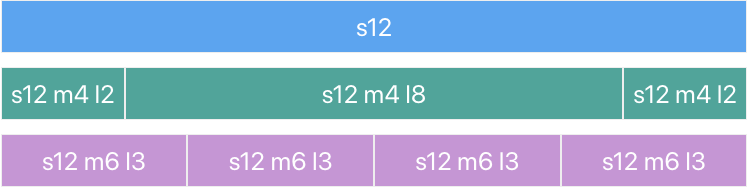](https://docs.intalioservices.com/uploads/images/gallery/2020-05/ozxPCiACEp3Ouf3h-image-1590660168382.png) ### ### 12 columns Our standard grid has 12 columns. No matter the size of the browser, each of these columns will always have an equal width.For now, just know that the `s1` stands for small-1 which in plain English means "1 column on small screens".
### ### Offsets To offset, simply add `offset-s2` to the class where `s` signifies the screen class-prefix (s = small, m = medium, l = large) and the number after is the number of columns you want to offset by. [](https://docs.intalioservices.com/uploads/images/gallery/2020-05/c4N0O81JB6g9lmxO-image-1590660033256.png) ### ### Responsive Layouts #### Screen Sizes| Mobile Devices <= 600px | Tablet Devices > 600px | Desktop Devices > 992px | Large Desktop Devices > 1200px | |
|---|---|---|---|---|
| **Class Prefix** | `s` | `m` | `l` | `xl` |
| **Container Width** | 90% | 85% | 70% | 70% |
| **Number of Columns** | 12 | 12 | 12 | 12 |
Default messages are available in Polish and English. If you want, you can add your own language.
Each form must contain a "translations" section. ```JSON { ... "translations": { "en": { "Alert -Validate-Success- confirmButtonText": "Send", "Alert -Validate-Success- title": "Your form is correct!", "Alert -Validate-Success- text": "Now you can send the form or correct.", "Alert -Validate-Success- showForm": "Show form", "Alert -Send-Success- confirmButtonText": "Ok", "Alert -Send-Success- title": "Success!", "Alert -Send-Success- text": "Your form has been sent correctly!", "Alert -Send-Error- confirmButtonText": "Ok", "Alert -Send-Error- title": "Error!", "Alert -Send-Error- text": "OTRS rejected the form!" }, "pl": { "Alert -Validate-Success- confirmButtonText": "Wyślij", "Alert -Validate-Success- title": "Formularz został poprawnie wypełniony", "Alert -Validate-Success- text": "Teraz możesz go wysłać lub poprawić.", "Alert -Validate-Success- showForm": "Zobacz formularz", "Alert -Send-Success- confirmButtonText": "Dobrze", "Alert -Send-Success- title": "Udało się!", "Alert -Send-Success- text": "Twój formularz został dostarczony!", "Alert -Send-Error- confirmButtonText": "Dobrze", "Alert -Send-Error- title": "Błąd!", "Alert -Send-Error- text": "OTRS odrzucił formularz!" } } } ``` We can add any number of translations to each section, we can also create our own section. Each place in the dynamic form system that displays data can take 2 text formats: - text - {text} ### Text Translation If you want to enable the use of forms in multiple languages, you must do the following. #### Enabling the language change button in the global settings Go to SystemConfig.json configuration and set the parameter "ShowLangButton" to **true**. ([Main configuration file - global settings](https://docs.intalioservices.com/books/dynamic-forms---installation-and-administrators-guide/page/main-configuration-file---global-settings "Main configuration file - global settings"))If you want, you can also adjust the color here and set the default language.
#### Adding translations to the form file. Now you just need to add translations to the form file. Below the last system translation \["Alert -Send-Error- text": "OTRS rejected the form!"\], you can add your own translations. #### Use of translations If you want to use a translation, you just need to enter its key in the braces.It will display "Your name", regardless of the selected language.
```JSON { "label":"Your Name" } ```It will display the translation of "Your name" from the section with the currently loaded language.
```JSON { "label":"{Your Name}" } ``` # Icons ### Icons are fully compatible with material design [](https://docs.intalioservices.com/uploads/images/gallery/2020-05/qC0vQvMS4NF5gXMH-image-1590662018472.png) If you want to add your icon, you can use all icons that come with the material design package.All available icons can be found at this address, for example: [https://material.io/resources/icons/?style=baseline](https://material.io/resources/icons/?style=baseline)
[](https://docs.intalioservices.com/uploads/images/gallery/2022-06/Eau8xzf6lQTAcFWS-image-1655992778898.png) [](https://docs.intalioservices.com/uploads/images/gallery/2022-06/z9kT2S6y7VrkJAEV-image-1655992789858.png) [](https://docs.intalioservices.com/uploads/images/gallery/2022-06/UafxkzOuh0fG9jjt-image-1655992794311.png) # OTOBO/OTRS integration # Integration with OTRS [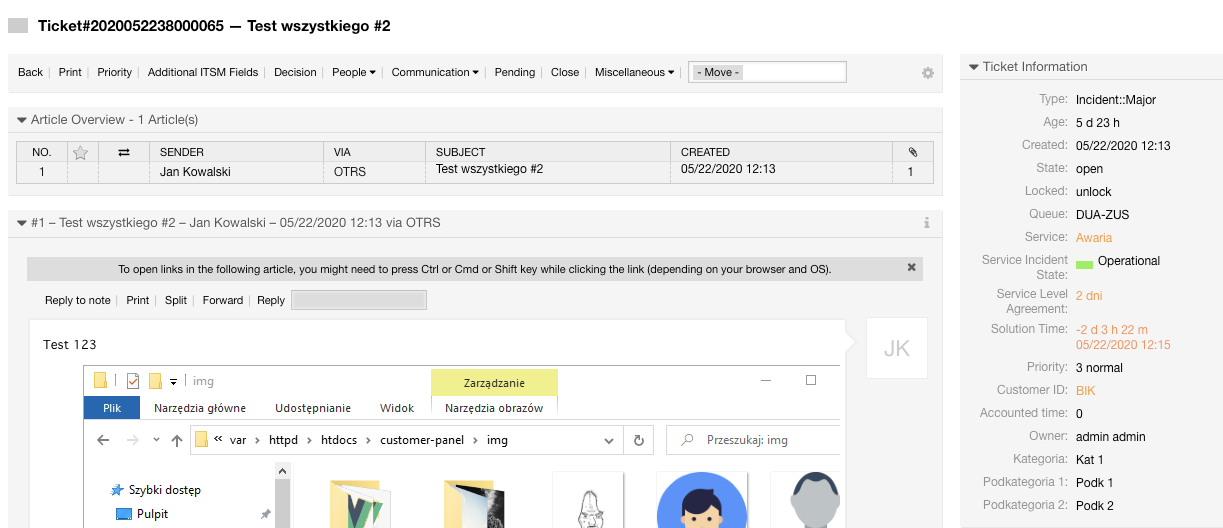](https://docs.intalioservices.com/uploads/images/gallery/2020-05/PCNszGJLZqYrGihT-image-1590658713409.png) The form system is very strongly integrated into OTRS.**Dynamic forms can be connected to any other system, but we provide full support for OTRS.**
### The order of the fields in the article You can see the sorting functions in "[Sorting of fields in the OTRS article](https://docs.intalioservices.com/books/dynamic-forms---installation-and-administrators-guide/page/sorting-of-fields-in-the-otrs-article "Sorting of fields in the OTRS article")" ### Display field as article content or dynamic field In each field there is a parameter "**otrs\_visible**" available, with it you can define where the content of the field is to be displayed - article, dynamic field etc.This field is mandatory and if you do not complete it, it will be set to "article" by default.
### Assignment of ticket title from the form The identifier of each field can be set to any text. But if you want to add, for example, an otrs title, you have to adapt to the appropriate structure. **SYSTEM\_Ticket\_\[OTRS field id\]****All fields for ticket description are available, e.g. title, queue, owner etc.**
If you want the owner of the ticket to become "john.kowalski" just add such an ID: "**OTRS\_Ticket\_Owner**".[Migrating from IntalioDynamicForms 1.0.x to IntalioDynamicForms 1.2.x](https://docs.intalioservices.com/books/dynamic-forms---installation-and-administrators-guide/page/migrating-from-intaliodynamicforms-10x-to-intaliodynamicforms-12x "Migrating from IntalioDynamicForms 1.0.x to IntalioDynamicForms 1.2.x")
### Assigning a queue from the form If you want to assign a queue to a ticket, simply set the ID to "OTRS\_Ticket\_Queue".[Migrating from IntalioDynamicForms 1.0.x to IntalioDynamicForms 1.2.x](https://docs.intalioservices.com/books/dynamic-forms---installation-and-administrators-guide/page/migrating-from-intaliodynamicforms-10x-to-intaliodynamicforms-12x "Migrating from IntalioDynamicForms 1.0.x to IntalioDynamicForms 1.2.x")
### Adding dynamic fields Dynamic fields are subject to a different rule, in their case we do not use a defined structure. The field identifier must be identical to the dynamic field identifier in OTRS.[Migrating from IntalioDynamicForms 1.0.x to IntalioDynamicForms 1.2.x](https://docs.intalioservices.com/books/dynamic-forms---installation-and-administrators-guide/page/migrating-from-intaliodynamicforms-10x-to-intaliodynamicforms-12x "Migrating from IntalioDynamicForms 1.0.x to IntalioDynamicForms 1.2.x")
### Assigning other OTRS fields All fields describing the ticket are available in dynamic forms. Just adjust to the structure **OTRS\_Ticket\_\[OTRS field id\]**.[Migrating from IntalioDynamicForms 1.0.x to IntalioDynamicForms 1.2.x](https://docs.intalioservices.com/books/dynamic-forms---installation-and-administrators-guide/page/migrating-from-intaliodynamicforms-10x-to-intaliodynamicforms-12x "Migrating from IntalioDynamicForms 1.0.x to IntalioDynamicForms 1.2.x")
# Administration settings In the system configuration you will find plenty of fields that will allow you to customise your Dynamic Forms system. To see all configuration options: 1. Click on the *Admin* tab and pick *System configuration* 2. Find **Intalio Dynamic Forms** in the *Navigation bar* 3. From the dropdown menu choose Core [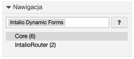](https://docs.intalioservices.com/uploads/images/gallery/2020-10/VUHGn0m5BjR4WjQu-image-1603104520977.png) ##### Intalio::DynamicForms::DefaultLock Possible values: - lock - unlock Specify if the ticket should be locked or unlocked when the ticket is created.Default value: **unlock**
--- ##### Intalio::DynamicForms::DefaultOwner Specifies the default owner of the ticket who will be assigned to the ticket after its creation by the form system (agent login). You should make sure that the agent with the login provided in this configuration exists.Providing the login of a non-existent agent will make it impossible to send the form.
Default value: **[root@localhost](mailto:root@localhost)**
--- ##### Intalio::DynamicForms::DefaultPriority Specifies the default priority of the created ticket.Default value: **[root@localhost](mailto:root@localhost)**
--- ##### Intalio::DynamicForms::DefaultQueue Specifies the default queue of the created ticket. You should make sure that the queue with the name you provided in this configuration exists in your system.Providing the name of a non-existent queue will make it impossible to send the form.
Default value: **[Raw](mailto:root@localhost)**
--- ##### Intalio::DynamicForms::DefaultState Specifies the default state of the created ticket. You should make sure that the state with the name you provided in this configuration exists in your system.Providing the name of a non-existent state will make it impossible to send the form.
Default value: **[new](mailto:root@localhost)**
--- ##### Intalio::DynamicForms::DefaultQueue Specifies the default queue of the created ticket. You should make sure that the queue with the name you provided in this configuration exists in your system.Providing the name of a non-existent queue will make it impossible to send the form.
Default value: **[root@localhost](mailto:root@localhost)**
--- ##### Intalio::DynamicForms::DefaultType Specifies the default type of the created ticket. You should make sure that the type with the name you provided in this configuration exists in your system.Providing the name of a non-existent type will make it impossible to send the form.
Default value: **[Unclassified](mailto:root@localhost)**
# Sorting of fields in the OTRS article #### Custom sort: You can use the "order\_by" and "order" params. You can find more information here: [Form configuration - file structure and general configuration](https://docs.intalioservices.com/books/dynamic-forms---installation-and-administrators-guide/page/form-configuration---file-structure-and-general-configuration "Form configuration - file structure and general configuration") If the field does not have the required parameter (e.g. "order"), it will be added at the end. #### By default: Fields are sorted by identifiers, if you want the fields to be in a certain order, you must name them accordingly. ***Example:*** ```JSON { "size": "s12 m6 offset-m3", "type": "number", "id": "2_FieldID", "label": "Number", "validate": [ "" ], "icon": "filter_1", "otrs_visible": "all", "hidden": false, "value": "" }, { "size": "s12 m6 offset-m3", "type": "textarea", "id": "1_FieldID", "label": "Textarea", "validate": [ "" ], "icon": "announcement", "otrs_visible": "all", "hidden": false, "value": "" } ```This configuration will cause the field "1\_FieldID" to be displayed above "2\_FieldID" in the OTRS article request.
# File permissions **Script: `/opt/otobo/bin/otobo.SetPermissions.pl` Directories User:** otobo **Group:** www-data **Minimum permissions:** 666 **Files User:** www-data Group:** www-data **Minimum permissions:** 660 # Migration Guide # Migrating from IntalioDynamicForms 1.0.x to IntalioDynamicForms 1.2.x ## SystemConfig.json ### OtrsUrl The parameter `OtrsUrl` has been changed to `SystemUrl`.The parameter values have also been changed in the default configuration file: `OTRS_URL` -> `XSYSTEM_URLX`
#### XSYSTEM\_URLX Is a parameter that will automatically be changed to the appropriate system url during package installation. ### SystemUrl\_DEV Added `SystemUrl_DEV`, if running the development version, the shipping address is taken from here. ### Alias This parameter stored the initial prefix to the forms system. Now its content has been changed from static `/otrs/route.pl/dynamic-forms/` to dynamic `XSYSTEM_ALIASX`This parameter is automatically completed during package installation.
## **Field config** ### Field ID and changing the values of the system fields When you want to change a value in OTRS, previously this was done using e.g. `OTRS_Ticket_Queue`, `OTRS_Ticket...`, now you can use one of the three entries `OTRS_Ticket...` `OTOBO_Ticket...` `SYSTEM_Ticket...`**SYSTEM\_TICKET** is good practice
### otrs\_visible the otrs\_visible parameter, from now on can be called either `otrs_visible`, `otobo_visible` or `system_visible`Good practice is **system\_visible**.
By default, if someone does not fill in this field - it will be automatically set to "article".
**FIX(1.2.x)** From now on the value "article" is assigned only to the article (this was not the case before)
### PDF Field The name of the printed PDF was taken from the field `OTRS_Ticket_Title`, now this field can be called both `SYSTEM_Ticket_Title` and `OTOBO_Ticket_Title`, if it is not, the pdf will be called **`IntalioDynamicForm`** ### ### Additional information 1\. Translations in forms should not point to OTRS so we changed e.g. "OTRS rejected the form!" to "The system rejected the form!" # Intalio Central Login Service Integration >= version F1.2.15 # Intalio CLS - Configuration ### Description **Intalio Central Login Service** [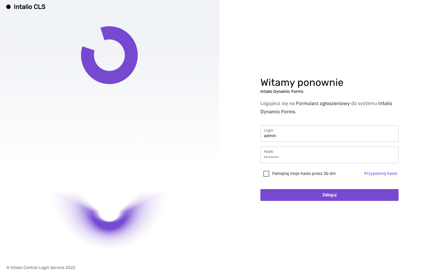](https://docs.intalioservices.com/uploads/images/gallery/2022-12/HbAvc1h1TkRvo9f5-image-1670339301343.png) ### Configuration #### SystemConfig.json ```JSON { "SystemUrl": "XSYSTEM_URLX", [...] "IntalioCLS": { "enabled": true, "url": "https://localhost:8081/" } } ``` `IntalioCLS` - *Container of Intalio CLS configuration* `enabled` - *The system is active* `url` - *Link to Intalio Central Login Service* #### Session verification [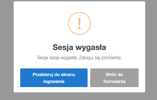](https://docs.intalioservices.com/uploads/images/gallery/2022-12/vH0mKrAeQ7hqJyPl-image-1670338487966.png) ##### check\_session\_id (*form param)* If this parameter is active (and Intalio CLS is active), the system will automatically check the validity of the user's session every 5 seconds. If the session expires, a popup will be displayed with information and an option to go to Intalio CLS. ##### translations The language configuration for the popup is set in the translations of the form. The available variables are: ``` "Alert -Session-Expired- title": "Session expired", "Alert -Session-Expired- text": "Your session has expired. Please log in.", "Alert -Session-Expired- confirmButtonText": "Redirect to login screen", "Alert -Session-Expired- cancelButtonText": "Show form" ``` #### Attention!The session verification mechanism only works when **"headless"** mode is disabled!