Form configuration - fields
- Attributes available for each field
- Button
- Checkbox
- Radio
- CompareField
- SelectField
- DateTime
- ImgButton - Image button - Extended HUB
- HTML/FAQ
- CKEditor
- File - File picker
- Text
- Textarea
- Number
- AdditionalForm
- Switch (>1.2.17)
Attributes available for each field
Each form must have some fields :D Dynamic forms allow you to create multiple field types. Each form field has a set of standard configurations. Additionally, fields can contain their own configurations.
These are settings that you can activate in any field.
size
The size of the field is defined on the basis of blocks, divide the screen into 12 parts and determine the size of the field "filling in these parts".12 will set the field size for the whole screen, 6 will set the field size for half the screen.
Screen sizes are defined by the letters s,m,l (small, medium, large). Setting s12 m6 l3 will set the value 12 for small screens, 6 for medium screens and 3 for large screens.
size: s12 m6
type
Field type, here we enter the specific field type you want to use e.g. select, text.
id
field identifier.
This value must be unique and must not contain spaces!
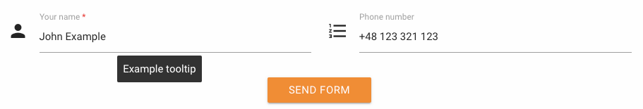
tooltip
When you hover over the field, a balloon will pop up, displaying any text or HTML.
label
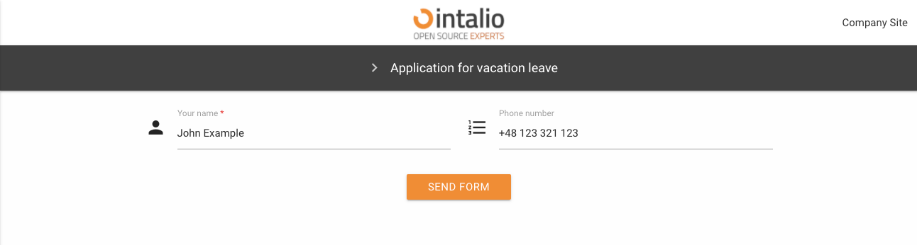
Here you can enter the field title e.g. "Your name".
validate
Here we can enter a list of any field validations (we can also create our own regex). An example of a validator is "required".
//example
"validate": ["required", "email"]Available validators
after
alpha - The field under validation may only contain alphabetic characters.
alpha_dash - The field under validation may contain alphabetic characters, numbers, dashes or underscores.
alpha_num - The field under validation may contain alphabetic characters or numbers.
alpha_spaces - The field under validation may contain alphabetic characters or spaces.
before - The field under validation must have a numeric value bounded by a minimum value and a maximum value.
between - The field under validation must have a numeric value bounded by a minimum value and a maximum value.
confirmed - The field under validation must have the same value as the confirmation field.
credit_card
date_between
date_format
decimal
digits - The field under validation must be numeric and have the specified number of digits.
dimensions - The file added to the field under validation must be an image (jpg,svg,jpeg,png,bmp,gif) having the exact specified dimension.
email - The field under validation must be a valid email.
ext - The file added to the field under validation must have one of the extensions specified.
image - The file added to the field under validation must have an image mime type (image/*).
in
integer - The field under validation must be a valid integer value. Doesn't accept exponentiale notation.
ip
is - The field under validation must match the given value, uses strict equality.
is_not - The field under validation must not match the given value, uses strict equality.
length - The field under validation must have exactly have the specified number of items, only works for iterables.
max - The field under validation length may not exceed the specified length.
max_value - The field under validation must be a numeric value and must not be greater than the specified value.
mimes - The file type added to the field under validation should have one of the specified mime types.
min - The field under validation length should not be less than the specified length.
min_value - The field under validation must be a numeric value and must not be less than the specified value.
not_in
numeric - The field under validation must only consist of numbers.
regex - The field under validation must match the specified regular expression.
required - The field under validation must have a non-empty value. By default, all validators pass the validation if they have "empty values" unless they are required. Those empty values are: empty strings, undefined, null, empty arrays.
size - The file size added to the field under validation must not exceed the specified size in kilobytes.
url
Parameters to attributes should be separated by ":" e.g. digits:11 - means 11 numbers allowed.
icon
Field icon. We can set any Material Design compatible icons here.
https://material.io/resources/icons/?style=baseline
hidden
Field display.
A field that is hidden still exists on the form (but is invisible) its values can be sent!
disabled
Field is disabled.
otrs_visible
Here we specify where the field is to be added.
default: article
article
The field will be added to the article.
dynamicfield
The field will be added where dynamic fields are displayed.
Remember that if the field will have an identifier that matches the dynamic field in OTRS, but will not have this value set - it will not be added as a dynamic field!
all
The field will be added both as a dynamic field (if the identifier matches the field in OTRS), and will be added to the note.
none
The field will not be added anywhere.
file
placeholder
Default value displayed in the field as a placeholer
value
Default field value. Here we can enter, for example, the default value of a selected item from the list or any other thing we want to complete by default on the form.
This value can be changed by the user while filling in the form - unless the field is disabled or hidden.
api
API mechanism allows you to edit any attributes of each field (after the data is loaded, it will be automatically refreshed and the view will be re-rendered).
The API mechanism was created so that data from external systems can be entered into the forms. Using api, you can change any field parameter at any time when using the form.
Usually the field "api" is used for normal downloading of data from external systems. For example, if you want to enter a default value when downloading from another system, just enter the address of the endpoint, which will return the data in the appropriate format.
The address will be queried as soon as the form is loaded.
Option "api_watcher" allows for more advanced actions.
Example:
Our API is available at https://example.intalio.pl
{
"size": "s12 m12",
"type": "text",
"max": 13,
"id": "ExampleFieldID",
"label": "Example field Label",
"icon": "confirmation_number",
"validate": [
"required"
],
"hidden": true,
"value": "",
"api":"https://example.intalio.pl"
},Response:
This way we can change any parameter of each field.
api_watcher
Okay, not always easy is the best. That's why we created "api_watcher."
This mechanism allows you to listen to changes in any fields and then send this information to any API.
This parameter allows you to complete the current field with data that are dependent on another field.
For example:
Directory of services - you choose "Hardware repair", and in the next step you choose the name of a specific item, e.g. "Computer repair".
To make such a form, the detailed field ("Repairing the computer") must listen for changes in the general field "Hardware repair". If there is any change in the general field - the detail field will ask the API and update its data.
Configuration:
{
"size": "s12 m12",
"type": "text",
"max": 13,
"id": "ExampleFieldID",
"label": "Example field Label",
"icon": "confirmation_number",
"validate": [
"required"
],
"hidden": true,
"value": "",
"api_watcher": {
"delay_api": "",
"fields": [
{
"field_id": "ExampleField_Main",
"api": "https://example.intalio.pl?DynamicFormField=${value}&lang=${LANG}"
}
]
}
},As you can see in the example above, the "api_watcher" mechanism allows you to paste the value received from the listened field anywhere. Add ${value} anywhere in the URL and the data will be pasted there. The currently loaded language will appear in place ${LANG}
Using ${value}
This is the key where the value from the listening field will appear.
Using ${LANG}
If your system is to support multiple languages, the API must also do it. To send the currently running form language to the API, you can add this parameter.
fields
"fields" is an array that can contain any number of fields for which the current field is to listen.
field_id
This is where you type the field identifier you want to listen to.
api
The address to be called after changing the data in the listening field.
api_add_lang
Do you include the variable ${LANG} and insert the currently selected language in its place
add_session_id_to_api
If you want to send a user session to the API, you can do so by activating this parameter. If it is activated, the system will automatically attach the sessionId parameter to each request.
If you want to authorize users or have access to user data via session, you must use this parameter.
pdf (>=1.2.20)
The pdf parameter allows you to control how a field is rendered in the generated PDF document.
This configuration affects only the PDF output and does not change the behavior of the field on the form.
The PDF configuration is read dynamically using getFieldProperties(fieldId).
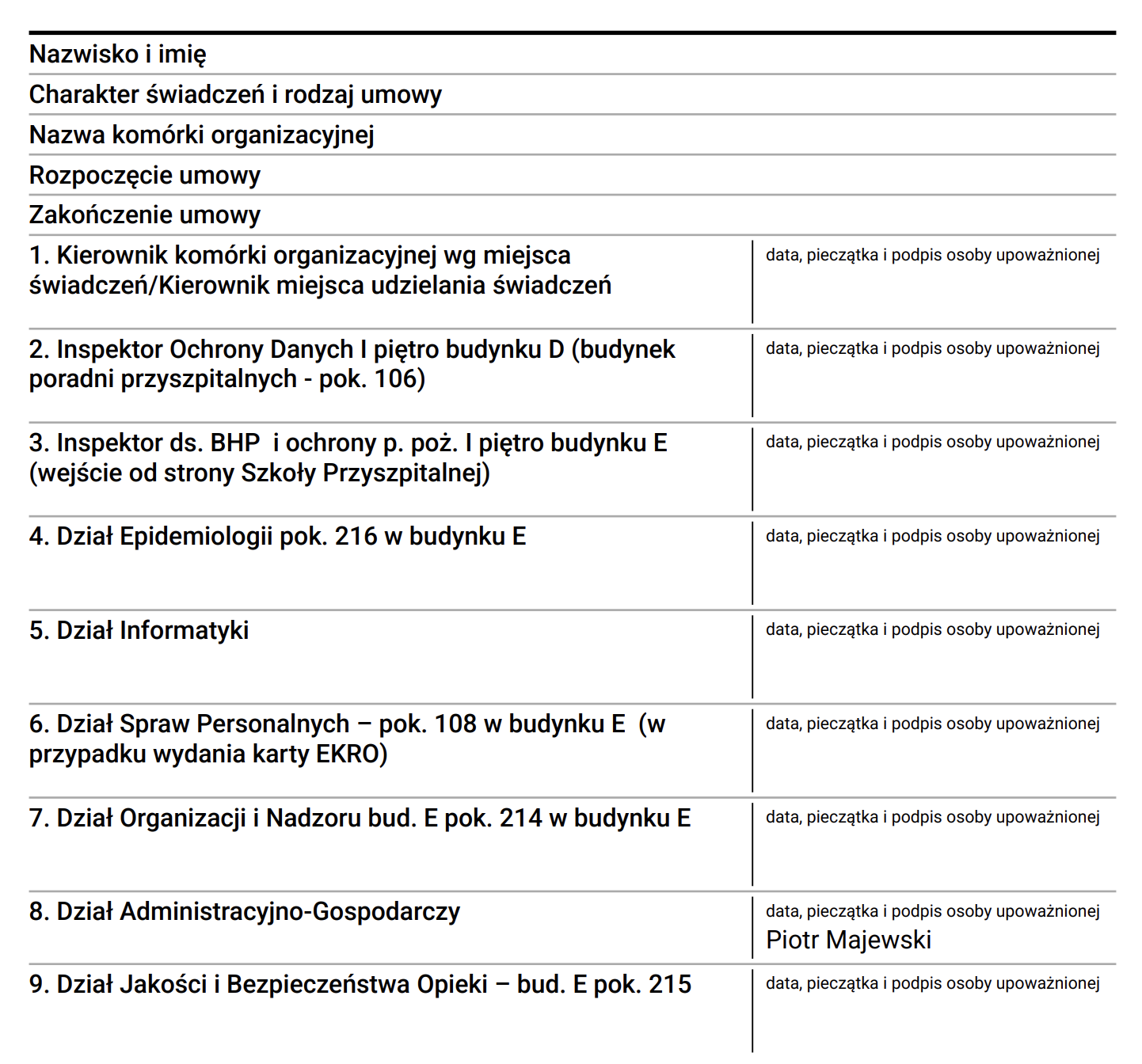
signature
If signature is set to true, the answer column in the PDF will be internally divided into two parts:
- Left side – field value
- Right side – signature area (separated by a vertical line)
If this parameter is not set or equals false, the field is rendered normally.
signatureLabel
Text displayed above the signature area.
Default value: "Podpis"
signatureText
If provided, this text will be displayed instead of an empty signature line.
This option is useful when confirmation is generated electronically and no manual signature is required.
Example use cases:
- Approved
- Not applicable
- Electronically confirmed
If set to false, the field will not be included in the generated PDF.
Default value: true
PDF rendering behavior
The main PDF table remains two-column:
Question | Answer
Only fields that have pdf.signature = true will have the Answer column internally divided into:
Answer | Signature
Other fields remain unchanged.
Example configuration
{
"size": "s12 m6",
"type": "text",
"id": "ApprovalField",
"label": "Approval",
"hidden": false,
"value": "",
"pdf":
{
"signature": true,
"signatureLabel": "Signature"
}
}Example with automatic confirmation text
{
"size": "s12 m6",
"type": "text",
"id": "StatusField",
"label": "Status",
"hidden": false,
"value": "",
"pdf":
{
"signature": true,
"signatureText": "Electronically approved"
}
}Button
Button (button)
download PDF example:
{
"mode": "PDF",
"pdf_action":"download",
"question_label": "{questionLabel}",
"answer_label":"{answerLabel}",
...
}submit form example:
{
"mode":"submit"
...
}clone fields example:
{
"mode": "clone",
"clone_additional_shift": -1,
"clone_fields": [
{
"id": "textField1"
},
{
"id": "textField2"
}
],
...
}mode
submit
This mode allows you to send a form. It has no additional configuration options.
clone (beta)
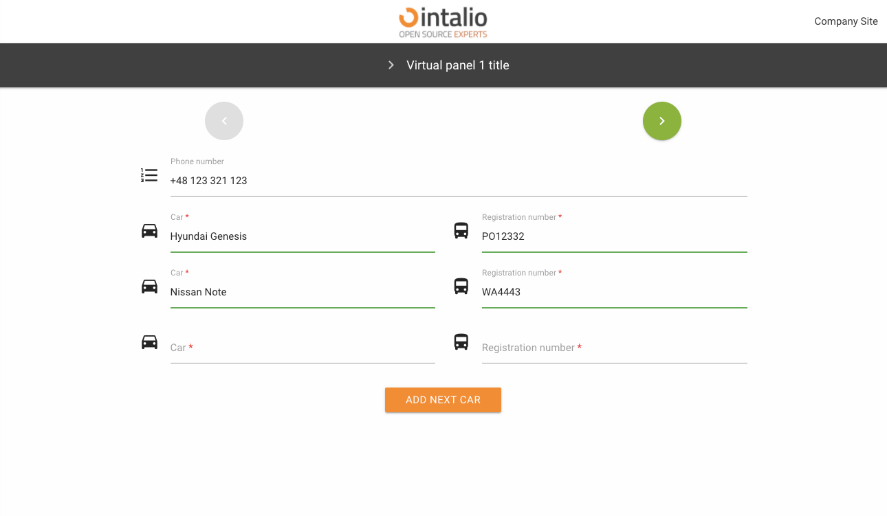
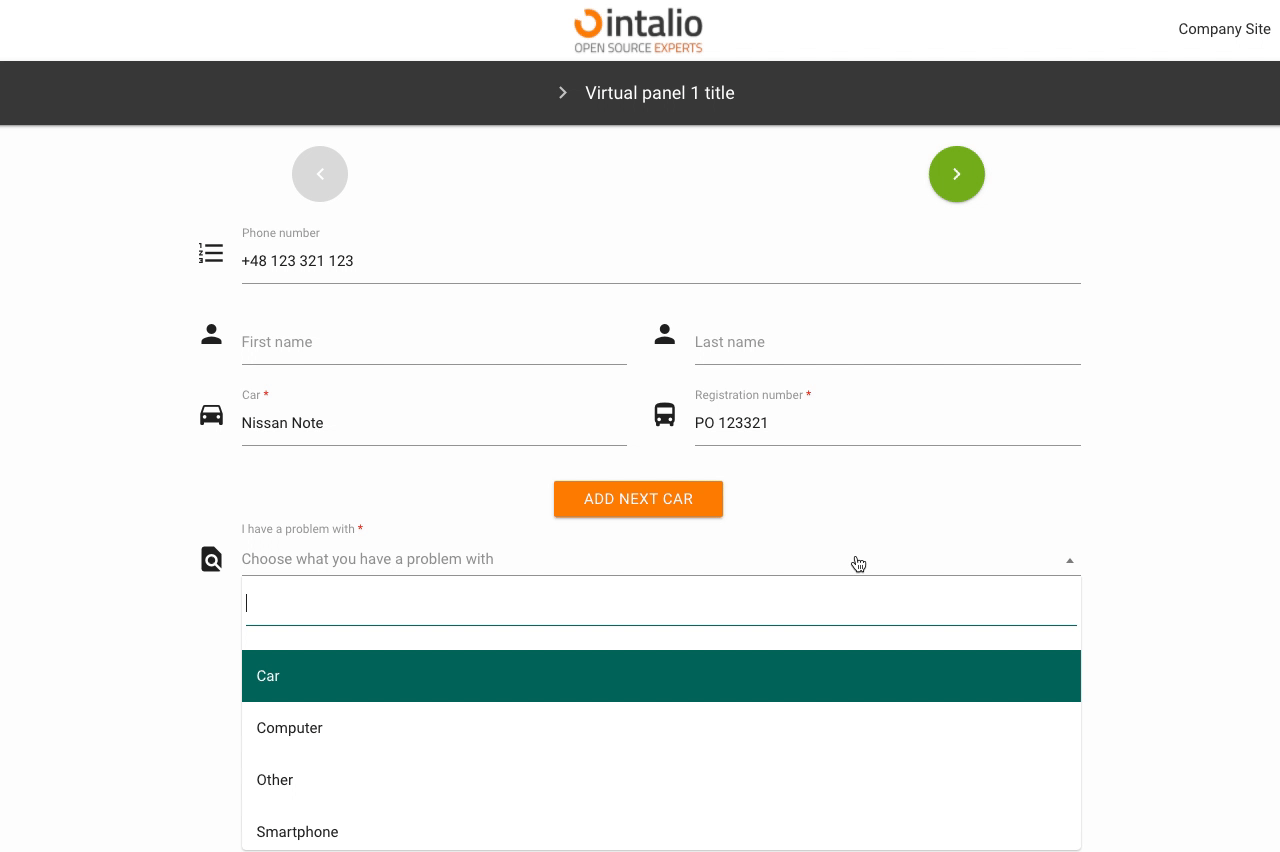
This mode was created so that any number of fields can be copied. Imagine you are creating a form where someone has to add their cars (we don't know how many cars there are).
Thanks to this solution, the person filling in the form can click the button to copy any number of fields.
Field identifiers will be generated according to the following pattern:
field name _ clone number _ internal number
Full example:
{
"size": "s12 m6",
"type": "text",
"id": "carModel",
"label": "Car",
"icon": "drive_eta",
"validate": [
"required"
],
"hidden": false,
"value": ""
},
{
"size": "s12 m6",
"type": "text",
"id": "carType",
"label": "Registration number",
"icon": "directions_bus",
"validate": [
"required"
],
"hidden": false,
"value": ""
},
{
"size": "s12 m12 center",
"type": "button",
"id": "clone_btn",
"mode": "clone",
"label": "Add next car",
"clone_additional_shift": -2,
"clone_fields": [
{
"id": "carModel"
},
{
"id": "carType"
}
]
}
}clone_additional_shift
Where are the new cloned fields to appear. Enter the number of fields from the button e.g. -1, then the fields will appear before the button.
The mechanism takes both positive and negative numbers.
clone_fields
List of cloned fields. Here you give a list with the ID of the fields you want to copy.
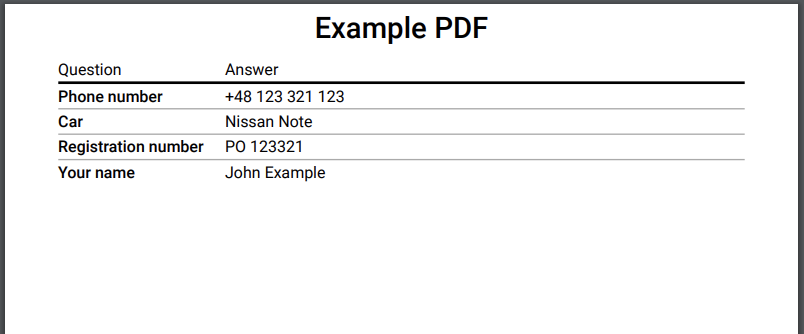
The PDF field allows you to generate a PDF printout of the entire form. You can download the file, print it or just open it in a new tab.
To generate a PDF file, you must have a field with the id "OTRS_Ticket_Title" this field will be set as the print title.
pdf_action
In this parameter you set what should happen to the generated file, you have several options available:
- open
- download
question_label
title of the first column of the resulting file.
answer_label
the title of the second column of the resulting file.
redirect
The redirection button. When you click it will take you to any other site.
redirect_type
Type of redirection, available:
- newWindow - redirection to the address in the new tab
- redirect - redirection in the current card
redirect_url
An address to redirect.
version >= 1.2.9
The system allows you to add the SessionID and LANG parameter to the url (the parameters are automatically set based on the current.
{
"size": "s12 m12 center",
"type": "button",
"id": "redirect_with_session",
"mode": "redirect",
"label": "Redirect with session",
"redirect_type": "newWindow",
"redirect_url": "https://google.pl?SessionID=${SessionID}&lang=${LANG}"
}Such a setting will redirect to the following link: https://google.pl?SessionID=123123&lang=en
The rest of the available parameters:
This field supports all parameters with "Attributes available for each field".
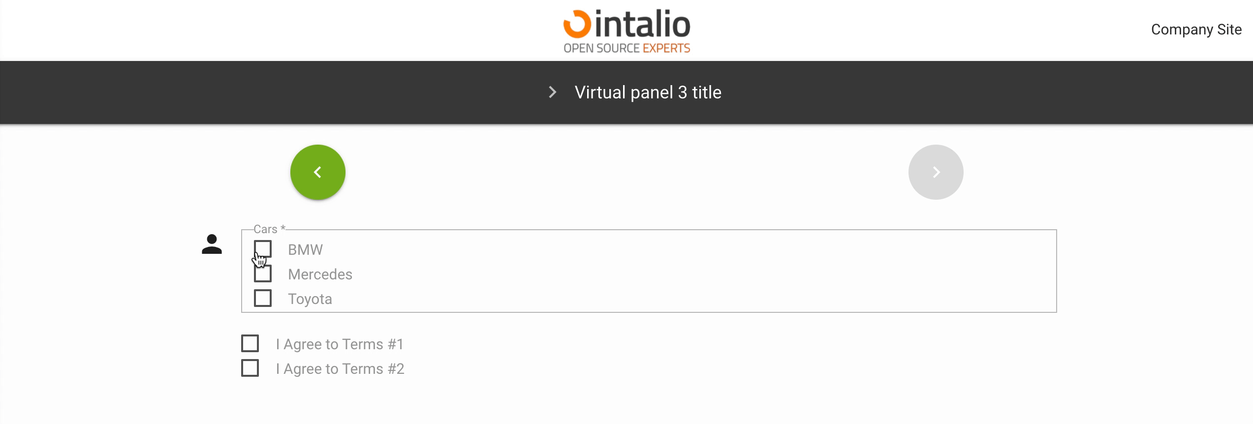
Checkbox
Checkbox (checkbox)
This field, which someone can select, appears in two versions - as a single field (e.g. for approval of a contract), or as a set of fields.
options_style
Here you can determine how the layout of the fields should look like (if you have more than one field).
For more information on what you can type in here, please see the Responsibility section.
define_output_value
Is the value that goes into the output system to be taken from the label or value parameter.
show_one_as_fieldset (1.2.2)
show_one_as_fieldset = true
show_one_as_fieldset = false

If we have one value and we still want to display it as fieldset.
options
All available options.
value
label
checked
Check if you want this option to be selected by default.
disabled
Check if you want this option to be inactive by default.
The rest of the available parameters:
This field supports all parameters with "Attributes available for each field".
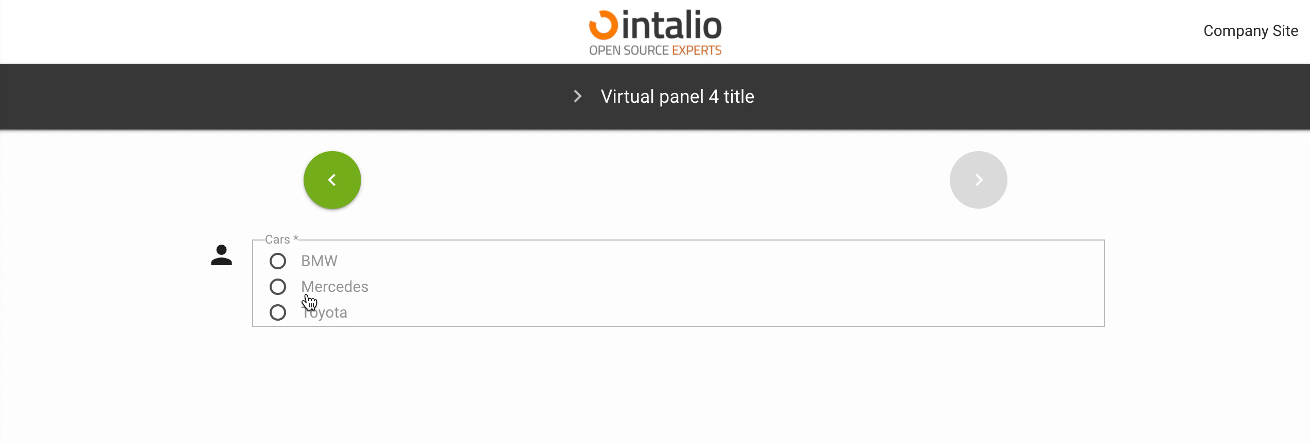
Radio
Radio (radio)
This field allows you to select one of the available fields.
options_style
Here you can determine how the layout of the fields should look like.
For more information on what you can type in here, please see the [responsive section].
define_output_value
Is the value that goes into the output system to be taken from the label or value parameter.
options
All available options.
value
label
checked
Check if you want this option to be selected by default.
disabled
Check if you want this option to be inactive by default.
The rest of the available parameters:
This field supports all parameters with "Attributes available for each field".
CompareField
CompareField (comparefield)
A compareField is a field that allows you to combine values from multiple fields. Thanks to this field you can combine several fields into one and send as e.g. request title.
example:
{
"fields": [
{
"id": "checkBoxField"
},
{
"id": "textField"
}
],
"output": "${textField} <-> ${checkBoxField}"
}This field has no view, it is a virtual field!
For example:
We have two fields "First name" and "Last name", we want these values to be sent as one field, e.g. the title of the request, and we also want to add "Your name:".
{
"fields": [
{
"id": "UserFirstName"
},
{
"id": "UserLastName"
}
],
"output": "Your Name: ${UserFirstName} ${UserLastName}"
}Our fields:
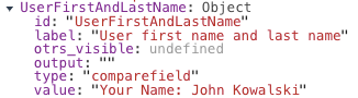
Field of type "compareField" had the identifier set to "UserFristNameAndLastName".
Its output value was "Your Name: John Kowalski".
Use of variables:
To combine the values of several fields, place the identifiers of these fields in two places.
First, you need to activate a field in the "fields" parameter, and then determine in what form you want this field to be displayed by adding it to the "output" parameter.
In the output parameter you only need to use the following sequence ${field identifier}, the rest depends on your imagination.
The rest of the available parameters:
This field supports all parameters with "Attributes available for each field".
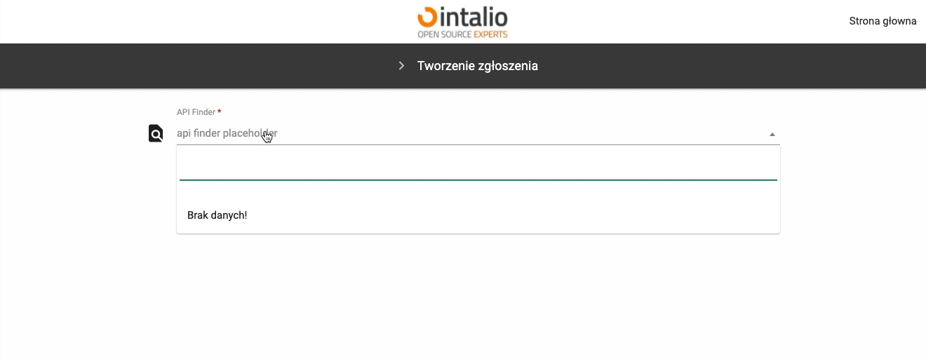
SelectField
SelectField (select)
This field allows you to display a list.
{
"size": "s12 m12",
"type": "select",
"id": "api_Finder",
"label": "API Finder",
"validate": [
"required"
],
"icon": "find_in_page",
"allow_add": false,
"search": true,
"search_error": "Brak pracowników pasujących do podanych kryteriów...",
"placeholder": "api finder placeholder",
"alphabetical_sorting": true,
"define_output_value": "label",
"add_session_id_to_api": true,
"api_dynamic": {
"delay": 250,
"api": "https://kprm.int.intalio.pl/otrs/get-all-users.pl",
"searching_label": "Trwa wyszukiwanie pracowników..."
},
"options": [
{
"value": "",
"label": "",
"selected": "true",
"disabled": "disabled"
}
]
},Enabling this parameter will add new things to the list. If your list is not closed, you can let new things be added to it.
search
It allows you to search in the list, if it is enabled together with "allow_add" you will be able to search, or if you do not find an interesting option - add your own.
search_error
If the item you are looking for is not found, the message given here will be displayed.
alphabetical_sorting
Enable alphabetical sorting of fields. If this option is disabled, the fields are displayed in the order given in the "options" parameter.
define_output_value
Each field is described by two parameters "label" and "value". If you want to, you can define here whether you want the system to be "label" or "value".
options
All available selection options.
Remember, if you don't want the first option to be checked by default, you must add an empty first option!
value
Field value.
label
Field label.
checked
Should the field be selected by default.
disabled
Is the field to be inactive by default.
api_dynamic
Added in version 1.0.24
This field allows you to search the api dynamically.
This field supports all other api attributes (e.g. add_session_id_to_api)
Response:
{
"options": [
{
"value": "p.majewski",
"label": "Piotr Majewski (p.majewski)"
},
{
"value": "piotr",
"label": "Piotr Nowak (piotr)",
}
]
}
delay
The number of milliseconds to wait for the user to stop typing before issuing the ajax request.
api
The url that the request should be made to.
searching_label
Translation for the search text.
The rest of the available parameters:
This field supports all parameters with "Attributes available for each field".
DateTime
DateTime (datetime)
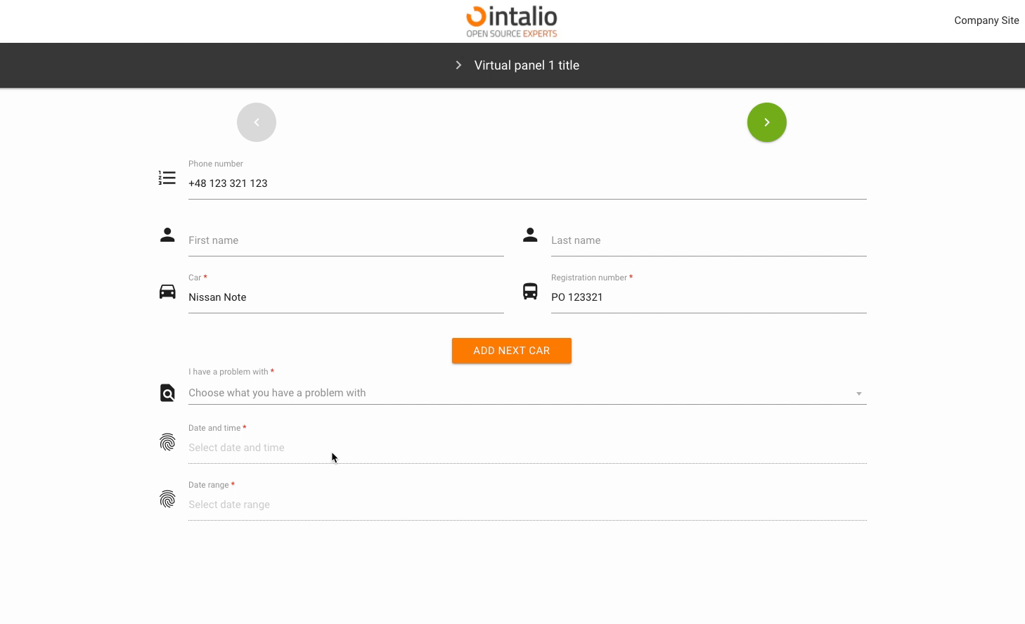
Example:
{
"size":"s12 m12",
"type":"datetime",
"id":"ExampleID",
"label":"Example Label",
"validate":[
""
],
"icon":"person",
"hidden":false,
"datetime_config":{
"locale":"English",
"enableTime":false,
"mode":"range",
"time_24hr":true,
"dateFormat":"Y-m-d H:i:00",
"altInput":true,
"altFormat":"Y-m-d H:i"
datetime_config
The date and time component is very extensive. The whole configuration in this case is in "datetime_config" and is passed directly to the component.
locale
Calendar language
enableTime
If you want the calendar to also display a component for time selection, you must have this option checked.
time_24hr
24-hour date format.
dateFormat
Output format, you can determine whether you want to send the day, month, year, hour, minute or you want to format it completely different.
This is an output format not shown on the screen! To change the format of the data displayed on the screen, use "altInput".

altInput
Do you run an alternative date display.
altFormat
Alternative date display, i.e. the outgoing date will be formatted on the basis of "dateFormat", but will be displayed on the basis of "altFormat"
noCalendar
Display only the component responsible for the time.
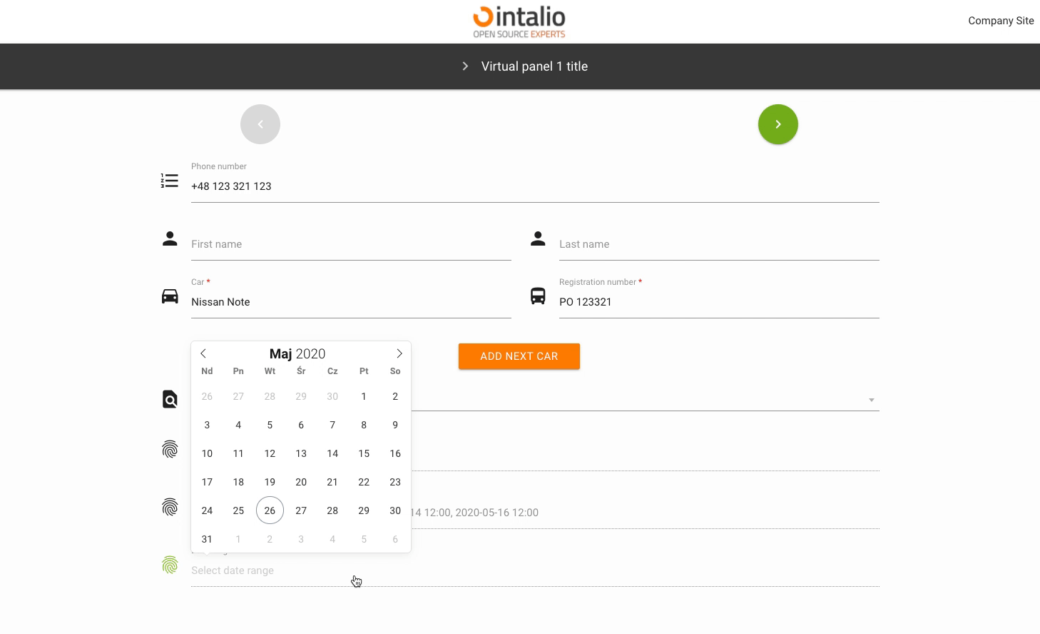
mode
Calendar mode. You can set whether someone should select a single date, a date range or whether they can select several independent dates.
none
A simple action.
multiple
Multiple date selection.
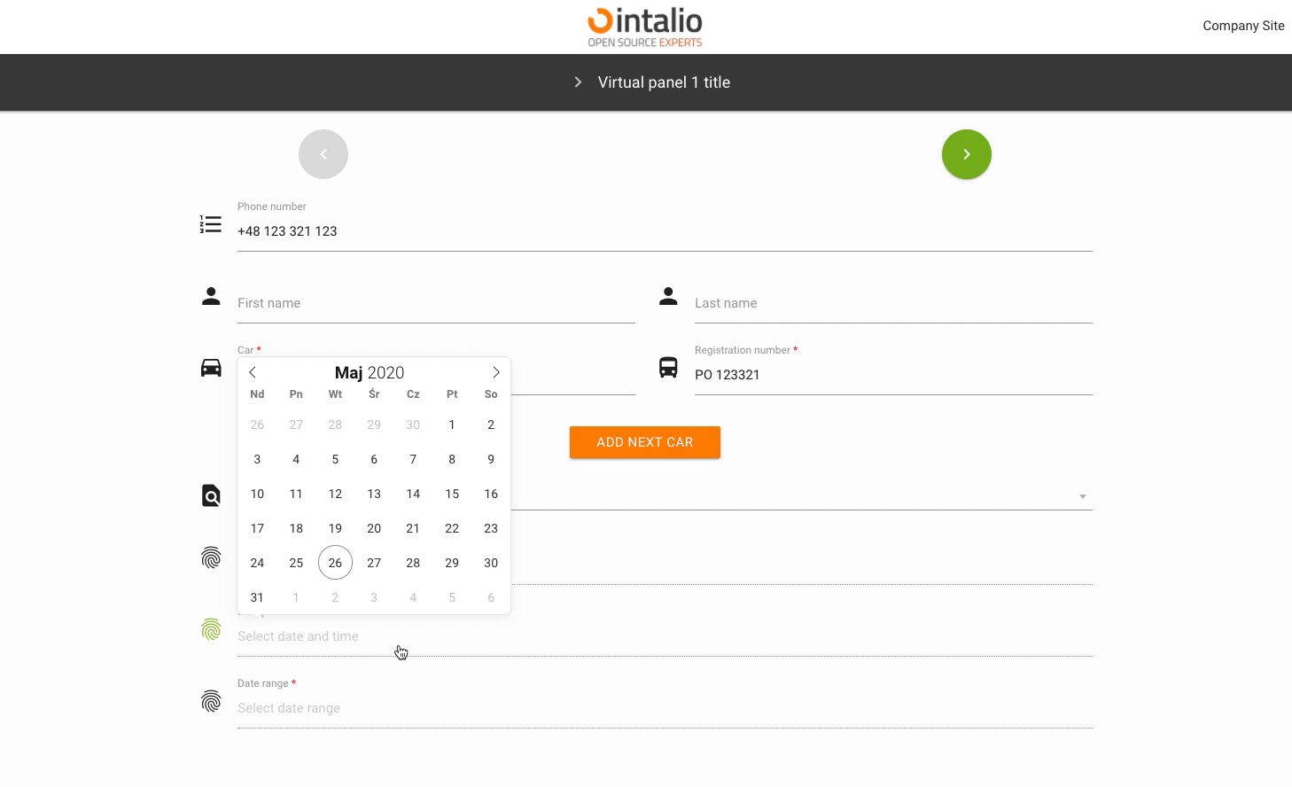
range
Selectable date range.
enable
Add the ability to select dates only from specific date ranges.
from
to
The rest of the available parameters:
This field supports all parameters with "Attributes available for each field".
ImgButton - Image button - Extended HUB
ImgButton (imgbutton)
The "ImgButton" mechanism allows you to create graphic buttons. You can use them to create e.g. another dashboard in the style "from general to specific".
If your system is going to have a lot of forms, you can create a lot of dashboards with buttons that will direct you to the next dashboards.
This element may or may not have a picture.
Example:
{
"size": "s12 m4",
"type": "imgbutton",
"id": "ImgButton3",
"otrs_visible": "all",
"label": " ",
"validate": [
"required"
],
"hidden": false,
"image": "/static/img/bus/fuel_cell.jpg",
"title": " ",
"description": "Description 3",
"redirect": "FuelCellConsultations.json",
"redirect_text":"Go"
} image
Image url. The image may be on the server or somewhere outside the server.
Remember that all additional elements must be in the static directory, only then they will be available at the url.
title
Text displayed on the button.
description
The description that will be displayed above the redirection button.
redirect
The address to which you want to redirect.
Here you can enter the file name of the next form e.g. "example1.json".
redirect_text
Text displayed on the redirection button.
The rest of the available parameters:
This field supports all parameters with "Attributes available for each field".
HTML/FAQ
HTML/FAQ (faq)
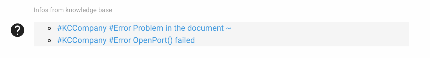
Field of type "faq" allows to render any html code. You can use it, for example, to search for duplicate tickets and inform the person filling in the form that such a ticket already exists in the system (just use "faq" field with API running).
In fact, whatever appears in the "value" field will be rendered, you can use this field to separate e.g. sections of the form or to display images.
Example - knowledge base:
{
"size": "s12 m12",
"type": "faq",
"id": "FAQ1",
"label": "Infos from knowledge base",
"validate": [
""
],
"icon": "help",
"hidden": true,
"value": "No data...",
"background_color": "#f5f5f5",
"api_add_lang": true,
"api_watcher": {
"delay_api": "",
"fields": [
{
"field_id": "Field_with_problem",
"api": "http://otrs.intalio.pl/otrs/knowledge-base-api.pl?Query=${value}"
},
{
"field_id": "A_field_to_describe_the_problem",
"api": "http://otrs.intalio.pl/otrs/knowledge-base-api.pl?Query=${value}"
}
]
},background_color
The background color of the field.
The rest of the available parameters:
This field supports all parameters with "Attributes available for each field".
CKEditor
CKEditor (ckeditor)
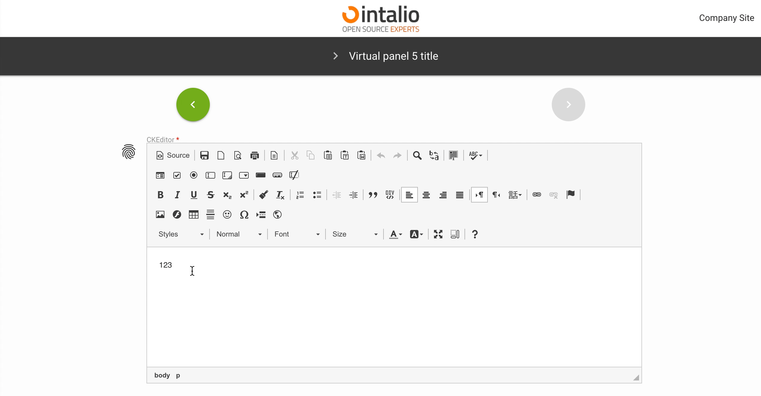
The CKEditor field allows you to display an advanced text editor. This editor can be configured according to the CKEditor documentation.
Example:
{
"size": "s12 m12",
"type": "ckeditor",
"id": "ckEditor",
"label": "CKEditor",
"validate": [
"required"
],
"icon": "fingerprint",
"hidden": false,
"value": "Your text...",
"config": {
"language": "en"
}
}config
Here you can use all available ckeditor settings
You can set up a lot of items that you will find in the official CKEditor documentation. An example parameter is language, which will change the language of the text editor.
CKEditor docs: https://ckeditor.com/docs/ckeditor4/latest/
The rest of the available parameters:
This field supports all parameters with "Attributes available for each field".
File - File picker
File picker (file)
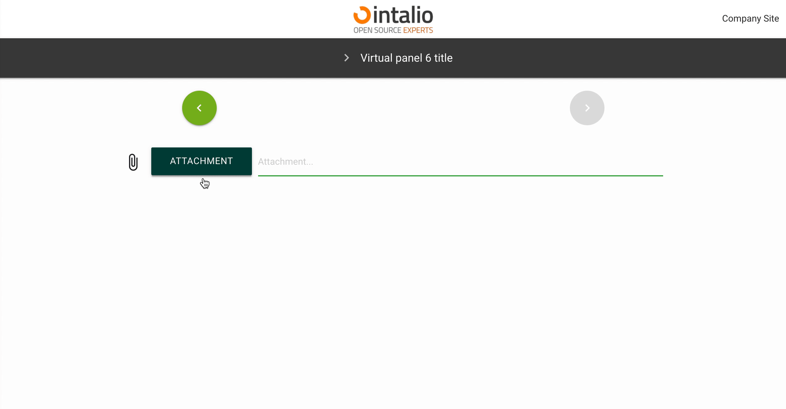
If you want to upload a file to the system, you can do so using the "file" field. Just add such a field to the form and you will be able to send any file.
If you want to send several files, you can add several fields.
The rest of the available parameters:
This field supports all parameters with "Attributes available for each field".
Text
Text (text)
This field allows you to enter text.
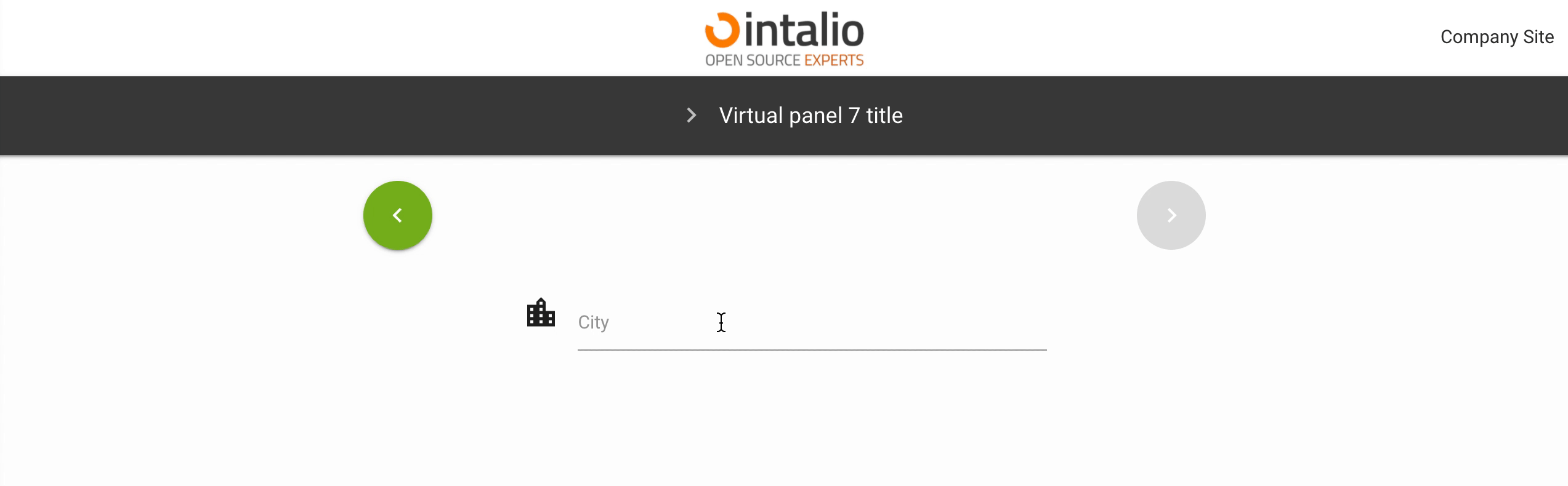
{
"size": "s12 m6 offset-m3",
"type": "text",
"id": "SelectCity",
"label": "City",
"validate": [
""
],
"icon": "location_city",
"otrs_visible": "all",
"hidden": false,
"value": ""
},
The rest of the available parameters:
This field supports all parameters with "Attributes available for each field".
Textarea
Textarea (textarea)
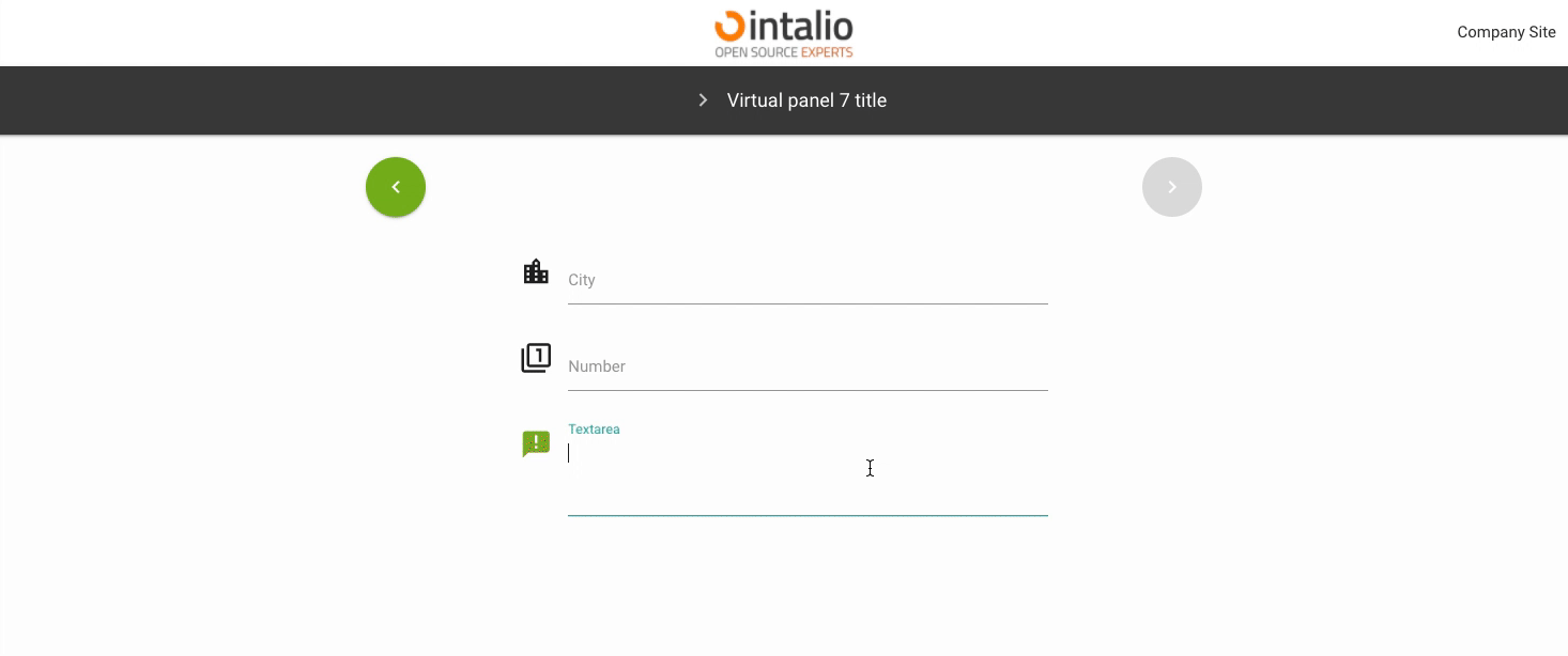
This field allows you to enter longer texts. Its size is determined dynamically based on the amount of text.
Example:
{
"size": "s12 m6 offset-m3",
"type": "textarea",
"id": "Textarea",
"label": "Textarea",
"validate": [
""
],
"icon": "announcement",
"otrs_visible": "all",
"hidden": false,
"value": ""
}
The rest of the available parameters:
This field supports all parameters with "Attributes available for each field".
Number
Number (number)
This field takes only numbers, you can use the validator to set e.g. ranges.
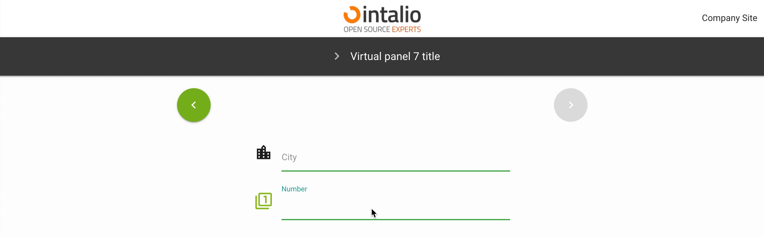
Example:
{
"size": "s12 m6 offset-m3",
"type": "number",
"id": "Number",
"label": "Number",
"validate": [
""
],
"icon": "filter_1",
"otrs_visible": "all",
"hidden": false,
"value": ""
}
The rest of the available parameters:
This field supports all parameters with "Attributes available for each field".
AdditionalForm
AdditionalForm (additionalForm) (1.2.2) (BETA)
This field allows you to dynamically load additional dynamic forms!
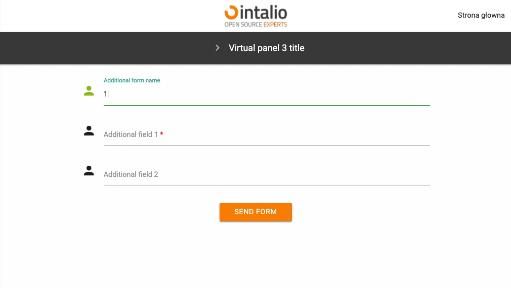
Example:
{
"size": "s12 m12",
"type": "additionalForm",
"id": "additionalForm",
"hidden": false,
"value": "",
"form_position": null,
"additional_fields": null,
"api_add_lang": false,
"api_watcher": {
"delay_api": "",
"fields": [
{
"field_id": "additionalFormName",
"api": "/static/FORMS/API/additionalForms/additionalForm[${value}].json"
}
]
}
}
Field requires 2 configuration options:
additional_fields
{
"form_position": 9,
"additional_fields":
[
{
"size": "s12 m12",
"type": "text",
"id": "additional_nazwaOperacji",
"label": "Nazwa operacji",
"icon": "person",
"validate": [
"required"
],
"hidden": false,
"value": ""
},
{
"size": "s12 m12",
"type": "text",
"id": "additional_opisProblemu",
"label": "Opis problemu",
"icon": "subject",
"validate": [
"required"
],
"hidden": false,
"value": ""
},
{
"size": "s12 m12",
"type": "file",
"id": "fileField",
"label": "Załącznik",
"validate": [
""
],
"icon": "attach_file",
"placeholder": "Załącznik...",
"hidden": false
},
{
"size": "s12 m12",
"type": "file",
"id": "fileField",
"label": "Załącznik",
"validate": [
""
],
"icon": "attach_file",
"placeholder": "Załącznik...",
"hidden": false
},
{
"size": "s12 m12",
"type": "file",
"id": "fileField",
"label": "Załącznik",
"validate": [
""
],
"icon": "attach_file",
"placeholder": "Załącznik...",
"hidden": false
}
]
}
form_position
index from which new fields are to be added
The "additional_form" mechanism is still in beta, so determining the order of the form may seem difficult.
...TODO...
Use cases:
For example, if any selection is to load an additional form from another file, we can use api_watcher and the additionalForm field.
Dynamically loaded forms currently do not support API dependencies.
The rest of the available parameters:
This field supports all parameters with "Attributes available for each field".
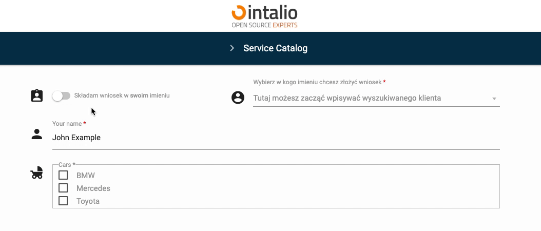
Switch (>1.2.17)
Switch (switch)
beta
This field allows you to set the value true or false. Allows advanced use when creating dynamic form logic.
{
"size": "s12 m5",
"type": "switch",
"id": "Switch",
"hidden": false,
"otrs_visible": "all",
"order": 3,
"tooltip": null,
"icon": "assignment_ind",
"icon_spacer": false,
"label": null,
"label_true": "Składam wniosek w <strong>czyimś</strong> imieniu",
"label_false": "Składam wniosek w <strong>swoim</strong> imieniu",
"validate": [],
"disabled": false,
"value": false
},Additional features
Icons
You can add your own icon, you can not add an icon, but still keep the spacing, this will make your form more aesthetically pleasing.
Default
Turning on the icon shows one icon.
"icon": "assignment_ind",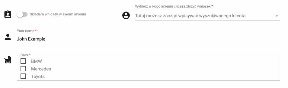
Without icon
Disabling the icon will not display any icon or spacer.
"icon": null,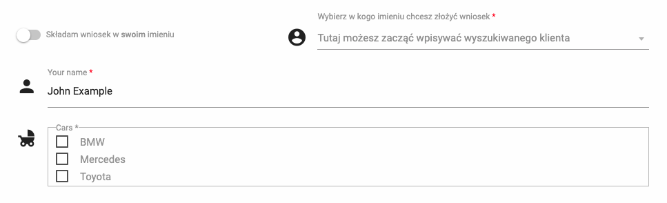
Without icon, but with spacer
The system generates an automatic space in place of the icon.
"icon": null,
"icon_spacer": true,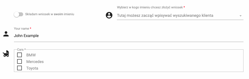
Labels
This field allows you to define labels more precisely. We can enable the default label (as in any other field), but we can also set the content of the label depending on the state of the field.
Default
This is the default setting and behaves like any other field.

"label": "Składam wniosek w swoim imieniu",
Dependent
This setting will change the button's label depending on the current state.

This parameter also accepts most html tags, e.g. <strong>
"label": false,
"label_true": "Składam wniosek w <strong>czyimś</strong> imieniu",
"label_false": "Składam wniosek w <strong>swoim</strong> imieniu",Styles
The color scheme of the button and its behavior can be customized in the configuration file found here: /FORMS/styles/custom_style.css


The rest of the available parameters:
This field supports all parameters with "Attributes available for each field".