Additional information
Output data structure
{
"options": {
// Section "options"
},
"data": {
// Section "data"
}
}Section "options"
Here you will find all additional information describing the form, e.g. checking the session, the session itself, the name of the form, etc.
Section "data"
Here are all the fields added to the form. Each field has several attributes:
type
Type of field to be sent.
id
The identifier of the sent field.
value
Field value.
Important!
This is a field value but one that is not configurable. For fields of the text type, it will be the same as the "output" attribute, but for fields of the select type, for example, it will always indicate the identifier of the selected option, that is the "value" parameter.
The "output_value" setting does not work on this field.
label
Field label.
output
Output field value. This value is set in the parameter "output_value".
ContentType
This attribute will only be added for the "file" field.
It indicates the type of attachment.
Filename
This attribute shall be added only in case of the "file" field.
It shall indicate the name of the attachment.
Example
{
"options": {
"check_session_id": false,
"name": "Application for vacation leave - Copy",
"session_id": "undefined"
},
"data": {
"OTRS_Ticket_Owner": {
"type": "text",
"id": "OTRS_Ticket_Owner",
"value": "+48 123 321 123",
"label": "Phone number",
"output": "+48 123 321 123"
},
"UserFirstName": {
"type": "text",
"id": "UserFirstName",
"value": "John",
"label": "First name",
"output": "John"
},
"UserLastName": {
"type": "text",
"id": "UserLastName",
"value": "Doe",
"label": "Last name",
"output": "Doe"
},
"UserFirstAndLastName": {
"type": "comparefield",
"id": "UserFirstAndLastName",
"value": "Your Name: John Doe",
"label": "User first name and last name",
"output": ""
},
"carModel": {
"type": "text",
"id": "carModel",
"value": "Nissan Note",
"label": "Car",
"output": "Nissan Note"
},
"carType": {
"type": "text",
"id": "carType",
"value": "PO 123321",
"label": "Registration number",
"output": "PO 123321"
},
"1_7_IssueType": {
"type": "select",
"id": "1_7_IssueType",
"value": "Car",
"label": "I have a problem with",
"output": "Car"
},
"dateTime": {
"type": "datetime",
"id": "dateTime",
"value": "2020-05-28 12:00:00",
"label": "Multiple date and time",
"otrs_visible": "all",
"output": "2020-05-28 12:00:00"
},
"dateTime2": {
"type": "datetime",
"id": "dateTime2",
"value": "2020-05-08 12:00:00",
"label": "Date range",
"otrs_visible": "all",
"output": "2020-05-08 12:00:00"
},
"Name": {
"type": "text",
"id": "Name",
"value": "John Example",
"label": "Your name",
"output": "John Example"
},
"OTRS_Ticket_Title": {
"type": "text",
"id": "OTRS_Ticket_Title",
"value": "Example PDF",
"label": "Example PDF",
"output": "Example PDF"
},
"Cars": {
"type": "checkbox",
"id": "Cars",
"value": [
"BMW"
],
"label": "Cars",
"output": []
},
"Rules1": {
"type": "checkbox",
"id": "Rules1",
"value": [
"I Agree to Terms #1"
],
"label": "Rules",
"output": []
},
"Rules2": {
"type": "checkbox",
"id": "Rules2",
"value": [
"I Agree to Terms #2"
],
"label": "Rules2",
"output": []
},
"Cars1": {
"type": "radio",
"id": "Cars1",
"value": "Mercedes",
"label": "Cars",
"output": ""
},
"ckEditor": {
"type": "ckeditor",
"id": "ckEditor",
"value": "<p><strong>1232</strong></p>\n",
"label": "CKEditor",
"output": "<p><strong>1232</strong></p>\n"
},
"23SelectCity": {
"type": "text",
"id": "23SelectCity",
"value": "London",
"label": "City",
"otrs_visible": "all",
"output": "London"
},
"Number1": {
"type": "number",
"id": "Number1",
"value": "123",
"label": "Number",
"otrs_visible": "all",
"output": "123"
},
"Textarea": {
"type": "textarea",
"id": "Textarea",
"value": "Hello,\nHello,\nHello,\nHello,\nHello,\nHello,\nHello,",
"label": "Textarea",
"otrs_visible": "all",
"output": "Hello,\nHello,\nHello,\nHello,\nHello,\nHello,\nHello,"
},
"fileField": {
"type": "file",
"id": "fileField",
"value": "BASE64 Content",
"label": "Attachment",
"output": {},
"ContentType": "application/octet-stream",
"Filename": "piler 28052020 - FOSS.md"
}
}
}
Field size and responsive web design
Dynamic forms can work on large, medium and small screens as well as on smartphones.
The size of fields is set in the parameter size.
The system can also work as an application installed on the phone in the form of PWA.
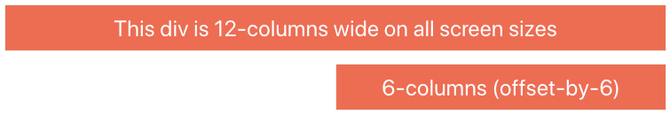
We are using a standard 12 column fluid responsive grid system. The grid helps you layout your page in an ordered, easy fashion.
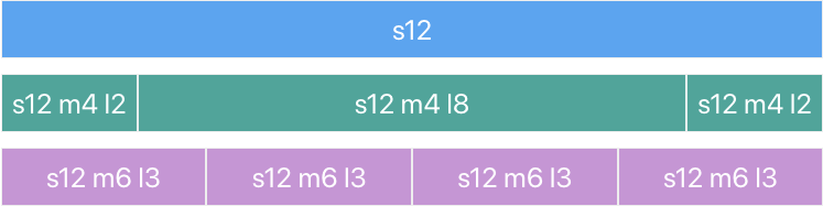
12 columns
Our standard grid has 12 columns. No matter the size of the browser, each of these columns will always have an equal width.
For now, just know that the s1 stands for small-1 which in plain English means "1 column on small screens".
Offsets
To offset, simply add offset-s2 to the class where s signifies the screen class-prefix (s = small, m = medium, l = large) and the number after is the number of columns you want to offset by.
Responsive Layouts
Screen Sizes
| Mobile Devices <= 600px |
Tablet Devices > 600px |
Desktop Devices > 992px |
Large Desktop Devices > 1200px |
|
|---|---|---|---|---|
| Class Prefix | s |
m |
l |
xl |
| Container Width | 90% | 85% | 70% | 70% |
| Number of Columns | 12 | 12 | 12 | 12 |

Multilanguage support
Dynamic forms can support any language.
The lower section of the form configuration contains translations in every available language. (File and directory structure)
Default messages are available in Polish and English. If you want, you can add your own language.
Each form must contain a "translations" section.
{
...
"translations": {
"en": {
"Alert -Validate-Success- confirmButtonText": "Send",
"Alert -Validate-Success- title": "Your form is correct!",
"Alert -Validate-Success- text": "Now you can send the form or correct.",
"Alert -Validate-Success- showForm": "Show form",
"Alert -Send-Success- confirmButtonText": "Ok",
"Alert -Send-Success- title": "Success!",
"Alert -Send-Success- text": "Your form has been sent correctly!",
"Alert -Send-Error- confirmButtonText": "Ok",
"Alert -Send-Error- title": "Error!",
"Alert -Send-Error- text": "OTRS rejected the form!"
},
"pl": {
"Alert -Validate-Success- confirmButtonText": "Wyślij",
"Alert -Validate-Success- title": "Formularz został poprawnie wypełniony",
"Alert -Validate-Success- text": "Teraz możesz go wysłać lub poprawić.",
"Alert -Validate-Success- showForm": "Zobacz formularz",
"Alert -Send-Success- confirmButtonText": "Dobrze",
"Alert -Send-Success- title": "Udało się!",
"Alert -Send-Success- text": "Twój formularz został dostarczony!",
"Alert -Send-Error- confirmButtonText": "Dobrze",
"Alert -Send-Error- title": "Błąd!",
"Alert -Send-Error- text": "OTRS odrzucił formularz!"
}
}
}We can add any number of translations to each section, we can also create our own section.
Each place in the dynamic form system that displays data can take 2 text formats:
- text
- {text}
Text Translation
If you want to enable the use of forms in multiple languages, you must do the following.
Enabling the language change button in the global settings
Go to SystemConfig.json configuration and set the parameter "ShowLangButton" to true. (Main configuration file - global settings)
If you want, you can also adjust the color here and set the default language.
Adding translations to the form file.
Now you just need to add translations to the form file. Below the last system translation ["Alert -Send-Error- text": "OTRS rejected the form!"], you can add your own translations.
Use of translations
If you want to use a translation, you just need to enter its key in the braces.
It will display "Your name", regardless of the selected language.
{
"label":"Your Name"
}It will display the translation of "Your name" from the section with the currently loaded language.
{
"label":"{Your Name}"
}Icons
Icons are fully compatible with material design
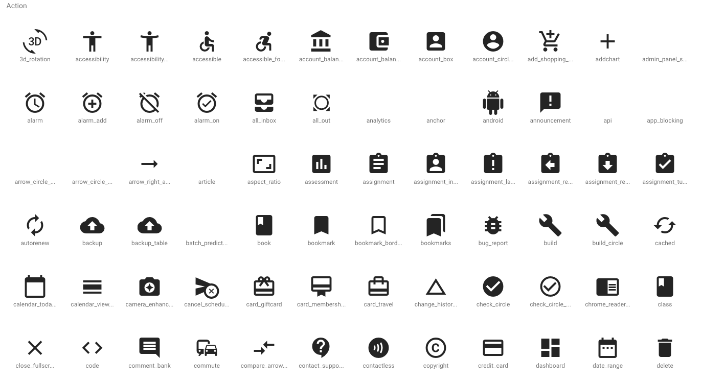
If you want to add your icon, you can use all icons that come with the material design package.
All available icons can be found at this address, for example: https://material.io/resources/icons/?style=baseline